Interaction Media Features and their potential (for incorrect assumptions)
Note: this article is now out of date. It references an old Editor’s Draft of the Media Queries Level 4 specification, and contains a fairly big misunderstanding about how any-hover:none would end up being evaluated by browsers in practice. See the updated version here: CSS-Tricks: Interaction Media Features and Their Potential (for Incorrect Assumptions).
The Media Queries Level 4 Interaction Media Features — pointer, hover and the more recent any-pointer and any-hover — are meant to allow sites to implement different styles and functionality (either CSS-specific interactivity like :hover, or even JavaScript behaviours, when queried using window.matchMedia), depending on the particular characteristics of a user’s input modalities.
Note: the Media Queries Level 4 Interaction Media Features are still at the Working Draft stage, so some of the wording/functionality – as well as the way in which it is implemented in browsers – may still change before they become stable recommendations. This article is based on the specification’s Editor’s Draft, 24 March 2015.
Common use cases cited for interaction media features are often “make controls bigger/smaller depending on whether the users has a touchscreen device or is using a mouse/stylus” and “only use a CSS dropdown menu if the user has an input that allows :hover-based interactions”.
pointer or hover@media (pointer:fine) {
/* ok to use small buttons/controls */
}
@media (hover:hover) {
/* ok to use :hover-based menus */
}
@media (pointer:coarse) {
/* make buttons and other “touch targets” bigger */
}
@media (hover:none), (hover:on-demand) {
/* suppress :hover-based menus */
}
What’s the primary input?
One of the problems with pointer and hover is that, by design, they only expose the characteristics of what a browser deems to be the primary input device – and current browser implementations may, in some cases, not be as smart as they should in making this assessment, since what constitutes a primary input may not always be obvious.
Traditionally, we could say that a phone/tablet’s primary input is the touchscreen. But on desktop/laptop devices, any hard distinction already becomes blurry: these devices usually have both a keyboard and mouse/trackpad. What is the primary input in this case? Currently, browsers make the assumption that in these situations, it’s the mouse/trackpad. But what if I’m actually a user who navigates only using the keyboard (which, depending on how things are coded, can be considered a pointer:fine — for focusable elements like links and buttons — or pointer:none device — in the case of custom interfaces, reliant on JavaScript events with coordinates, such as a <canvas> — lacking :hover)? This particular case is (sort of) acknowledged in the spec:
For accessibility reasons, even on devices whose pointing device can be described as fine, the UA may give a value of coarse or none to this media query, to indicate that the user has difficulties manipulating the input device accurately or at all.
At the time of writing, there are no options in browsers/UAs that let a user explicitly say “I’m a keyboard user” (let’s not even mention the “I’m a user with reduced mobility” scenario, where a user may in fact be using a mouse/trackpad — or even an alternative input method such as a head wand, or a virtual mouse, which translates back to actual mouse inputs — but with great difficulty and reduced accuracy).
Beyond the accessibility angle, there are further issues with the concept of primary inputs. What about devices like a Microsoft Surface, with a touchscreen, stylus and (with addition of a type cover) a trackpad and keyboard? Arguably, these devices blur the definition of primary input completely (though there is potential here for browsers to implement heuristics — consider Windows 10’s ability to switch to “Tablet mode”, which browsers could take as indication to treat any available touchscreen as primary).
Note: For a similar take on this problem, see Stu Cox: The Good & Bad of Level 4 Media Queries, although his post refers to an earlier iteration of the spec, which only contained pointer and hover and a requirement for these features to report the least capable, rather than the primary, input device.
So, right out of the gate, the fact that pointer and hover only relate to what the browser believes to be the primary input may lead to wrong results on devices with potentially two or more different primary inputs.
Fundamentally then, the problem with the original pointer and hover is that they don’t always adequately cover multi-input scenarios, and rely on the browser to be able to be able to correctly pick a single primary input. A user may for instance have paired a bluetooth mouse to their phone/tablet — suddenly, instead of a pointing device with pointer:coarse and hover:none, they have an additional pointer:fine, hover:hover capable one. But in all current implementations, browsers will still regard the touchscreen as the primary input. If a web developer relies purely on pointer and hover to add specific styling or functionality, no extra media queries based on these capabilities would kick in.
| feature | touchscreen | touchscreen + mouse | desktop/laptop | desktop/laptop + touchscreen |
|---|---|---|---|---|
pointer:none | false | false | false | false |
pointer:coarse | true | true | false | false |
pointer:fine | false | false | true | true |
hover:none | false | false | false | false |
hover:on-demand | true | true | false | false |
hover:hover | false | false | true | true |
Note: from my (admittedly limited to Android/Blink) testing, it seems that on touchscreen devices, hover:on-demand, rather than hover:none, returns true — probably a conscious decision on the part of Blink, related to the fact that :hover (and even compatibility mouse events like mouseover) can be triggered by a touchscreen “tap”.
That’s where any-pointer and any-hover are supposed to come into play.
Testing the capabilities of all inputs
Instead of focusing purely on the primary input, any-pointer and any-hover report the capabilities of all available inputs. Going back to the original use cases for the interaction media features, instead of basing our decision to provide larger/smaller inputs or to enable/disable :hover-based functionality only on the characteristics of the primary input, we can make that decision based on the characteristics of any available inputs. Roughly translated, instead of saying “only offer a CSS menu if the primary input has hover:hover”, we can build media queries that equate to “only offer a :hover based menu if at least one of the inputs available to the user has hover:hover capability”.
Per the specification, user agents should re-evaluate media queries in response to changes in the user environment. Once properly implemented, the any-pointer and any-hover interaction media features will change dynamically when inputs are added/removed — so a site/app could immediately react to, say, a mouse being paired with a touchscreen device.
Note: in Chrome’s current implementation, the values for these media features are not updated dynamically, and even remain the same after a refresh — see my video Chrome 42 Beta: any-pointer/any-hover MQ feature issue and the related Chromium bug Issue 442418: Support dynamic values for interaction media queries.
In order to support multi-input scenarios, where different inputs may have different characteristics, in the case of any-pointer and any-hover
more than one of their values can match, if different input devices have different characteristics
(compared to pointer and hover, which only ever refer to the capabilities of the primary input). In current implementations, these media features evaluate as follows:
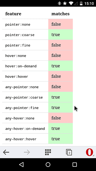
| feature | touchscreen | touchscreen + mouse | desktop/laptop | desktop/laptop + touchscreen |
|---|---|---|---|---|
any-pointer:none | false | false | false | false |
any-pointer:coarse | true | true | false | true |
any-pointer:fine | false | true | true | true |
any-hover:none | false | false | false | false |
any-hover:on-demand | true | true | false | true |
any-hover:hover | false | true | true | true |
Note: you can see how the interactive media features are evaluated on your specific device. Currently, interaction media features are supported in Blink (since M-21 for pointer/hover, although it was somewhat broken until M-41 — Issue 123062: Support pointer and hover CSS media features for touch screens and Issue 441613: @media (hover: none) should be false on a traditional desktop/laptop computer — and M-41 for any-pointer/any-hover — Issue 398943: Ship any-pointer and any-hover Media Queries) and the preview release of Internet Explorer/Spartan (status.modern.ie). Safari should have support for these soon (Changeset 179055). There does not appear to be any movement on implementing these features in Firefox yet.
Potential for incorrect assumptions
Certainly, it’s valuable for a developer to be able to know the characteristics of any input device that the user has at their disposal. However, as with similar feature detection methods, developers need to be aware of what exactly they’re detecting (in a similar way to the problem I outlined in my article on Detecting touch: it’s the “why”, not the “how”) and to understand the fundamental limitations of the current approach: that in many cases, it doesn’t matter so much what inputs (and their specific characteristics) are potentially available to a user — what matters, in my opinion at least, is what input the user is using right now.
Take the example of a phone/tablet with a paired mouse: any-hover:hover will be true, as there is a hover-capable input present — but does that mean that we can now rely on hover-based functionality? What if the user, regardless of the mouse, is still using the touchscreen?
any-pointer or any-hover@media (any-pointer:fine) and (any-hover:hover) {
/* at least one device is mouse-like…
we can use small buttons and :hover-based menus, right?
what if they’re using a touchscreen… */
}
Targeting the least capable input
Since we cannot know for sure which input is currently being used, I would suggest that any-pointer and any-hover are most valuable for checking the lowest common denominator, the least “capable” input. In the example of the phone/tablet with a paired mouse, we’d still only be able to use the information provided by any-pointer and any-hover to determine that yes, even though there are different inputs available, one of them is still coarse and does not support hover.
any-pointer or any-hover for lowest common denominator@media (any-pointer:coarse) {
/* at least one input is “coarse”
make buttons and other “touch targets” bigger */
}
@media (any-hover:none), (any-hover:on-demand) {
/* at least one input has no or (usually clunky)
“on-demand” hover suppress :hover-based menus */
}
Instead of testing for the presence of a particular capability, we could of course test for the absence of less capable inputs, and suppress styles that would otherwise be needed if those limited input types were present. However, the limited way in which the logical not works in Media Queries Level 3 (which don’t support chaining multiple tests together with a comma — the logical or — and negating the whole resulting expression) makes this unnecessarily cumbersome, since we can effectively only test for the absence of one of the values at a time:
@media not all and (any-pointer:coarse) {
	/* no inputs are “coarse”
	they may be “fine” or “none” */
}

@media not all and (any-hover:on-demand) {
	/* no input with “on-demand” hover is present
	they either have “hover” or “none” */
}

@media not all and (any-hover:none) {
	/* no input without hover is present
	they either have “hover” or “on-demand” */
}
Note: normally, the all and part would be superfluous, but it seems that in many current browser implementations, not only works correctly with an explicit media type as part of the query.
We could try to work around the limitations of not by using nested @media blocks, but this further increases complexity and has the potential for cross-browser incompatibilities at this point:
@media queries@media not all and (any-hover:none) {
@media not all and (any-hover:on-demand) {
/* neither “none” nor “on-demand” hover inputs are present
meaning all inputs have `hover:hover`
safe to use hover-based features?
still does not identify keyboard users at the moment */
}
}
Lastly, we could wait for the “full boolean algebra” approach of Media Queries Level 4 media conditions — but this is not currently supported in any browser:
@media not ((any-pointer:none) or (any-pointer:on-demand)) {
	/* as above, but far more readable
	sadly, not supported in any browser yet */
}
Regardless of which specific approach we opt for, in the end, we can use any-pointer and any-hover to find our baseline for the least capable input, rather than trying to determine the most capable one.
Query responsibly
For me, the take-away from all this is: pointer and hover tell you about the capabilities of whatever the browser/UA determines to be the primary device. In current implementations this information is mostly useless, as there may be additional input methods, and the browser may have made assumptions which are not correct. any-pointer and any-hover tell you about the capabilities of all connected inputs, and with some degree of media query acrobatics we can even narrow down the overall range of potential capabilities available. But none of these tell you specifically about the capabilities of the input device your user is using right now — and of course, you can only know what specific input a user will be using once they already started an interaction, at which point it’s likely too late to switch around style or functionality.
By all means, you can start using Media Queries Level 4 Interaction Media Features to make your site respond to different input device capabilities — but beware false assumptions about what these media features actually tell you, particularly in current browser implementations. Or keep it simple: design for all types of input and/or offer the user an explicit way to switch to their preferred mode.
(With thanks to Stu Cox and Florian Rivoal for their invaluable feedback on the early stages of this article)