Creating Game-Style Parallax Scrolling: Zombie Edition
Introduction
Ready to enter the world of parallax scrolling websites? Yes, scrolling sites are absolutely everywhere. Sadly, sometimes they do little more than distract and disorient a user in an attempt to show off, but when done correctly, they can make the web a more exceptional place. At its best, parallax scrolling can help users explore content in an immersive and engaging way.
With that said, my team has recently started employing scrolling animation with some of our content pieces. We were inspired by a piece about the history of ADT, and then decided to up the ante for an interactive zombie infographic about the popular AMC show The Walking Dead. Today, I’d like to take you behind-the-scenes on that project and show you how to use a JavaScript plugin called Skrollr.js, which we found to be helpful in getting the piece up and running.
Simply defined, Skrollr is a plugin that allows you to create precise scroll-based animations (parallax or otherwise) using just HTML and CSS. There are a lot of advantages to this, which you can learn more about in the Skrollr documentation. In this tutorial, we’ll also use JavaScript and some sprites to create a simple walk cycle animation that responds forwards and backwards to the user’s scrolling. By the end of this tutorial, we’ll have a character walking through a parallax environment, transforming from human to zombie.
First, you’ll need to download a few source files. I’ve provided some images from the Walking Dead project, as well as the needed JavaScript files, and an HTML skeleton. Grab those bad boys and we’ll get rolling.
Phase 1 — Parallaxing Background
We’re going to create the first couple of parallaxing background layers by adding a few <div>s with some HTML5 data- attributes, a touch of CSS in our stylesheet, and we’ll also call the .init() function on Skrollr in our main .js file. As you’ll see in the code below, the parallaxing layers need to be the children of an element with the id="skrollr-body". Some of the classes and IDs will seem excessive at first, but they’ll make sense as we add more elements later in the tutorial.
HTML:
<div id="skrollr-body">
	<div id="Scene">
		<div id="bg1" class="parallax-layer"
			data-0="left:0px;"
			data-5000="left:-1000px;">
		</div>
		<div id="bg2" class="parallax-layer"
			data-0="left:0px;"
			data-5000="left:-2500px;">
		</div>
	</div>
</div>
The magic we’re about to witness is all in the data- attributes. When Skrollr is called, it will sift through all the elements within #skrollr-body, and will render the appropriate animations based on those attributes. The number connected to the data attribute corresponds with the number of pixels the user has scrolled, and the value of the attribute is the style the element will have at that position. In #bg1 above, we’re telling Skrollr we’d like it to animate the div by shifting it 1,000 pixels to the left as the user scrolls from the top of the page (data-0) to 5,000 pixels down the page (data-5000). At those supplied values, Skrollr will move the div approximately 1 pixel to the left for every 5 pixels the user scrolls. This animation will occur forwards and backwards, so the user can scroll either direction and Skrollr will render it properly.
Based on the values supplied in the data-* attributes of #bg2, you can see we’re moving it at a much faster rate—1 pixel to the left for every 2 pixels scrolled, hence creating the illusion of 3D space. Before running this though, we need to add some CSS to pull in and properly frame our images, and then also issue the Skrollr initialization call.
CSS:
We want the scene to be vertically centered in a 700px tall frame
#Scene{
	position: fixed;
	width: 100%;
	height: 700px;
	margin-top: -350px;
	top: 50%;
	}
.parallax-layer{
	position: absolute;
	height: 700px;
	background-repeat: no-repeat;
	}
#bg1{
	background: url(../images/bg-1.jpg);
	width: 3528px;
	}
#bg2{
	background: url(../images/bg-2.png) left bottom;
	/* These images are big… but worth it */
	width: 4368px;
	}
JavaScript:
skrollr.init();
We’ll be doing more here later, so I’d keep this in a separate file… but you don’t necessarily have to.
Viola! We have parallax!
Phase 2 — Foreground Elements
Next, we’re going to add some elements to the foreground: an extra layer of clouds, the sun, a schoolhouse (which we’ll use to hide the character during the transformation from human to zombie) and the character himself.
First, let’s add the second layer of clouds. We’ll have it slide across the screen at the same pace as #bg2, so we can just add it within that div and it will inherit the same animation (which is based on absolute positioning) just as an inner div would normally inherit the CSS positioning of its parent.
HTML:
<div id="bg2" class="parallax-layer"
	data-0="left:0px;"
	data-5000="left:-2500px;">
	<div id="cloud"></div>
</div>
CSS:
#cloud{
	position:absolute;
	background:url(../images/clouds.png);
	width:2059px;
	height:347px;
	}
Now we’ll add the schoolhouse and the pre-zombie character. We’ll have the schoolhouse travel slightly faster than #bg2, and because of the perspective it was drawn at, we’re going to slice it into a top and a bottom layer and put the zombie in between them so it appears that he is passing through the doorway.
HTML:
<div class="parallax-layer">
	<div id="schoolunder" class="school"
		data-0="left:2000px;"
		data-5000="left:-1500px;">
	</div>
	<div id="zombie"></div>
	<div id="schoolover" class="school"
		data-0="left:2000px;"
		data-5000="left:-1500px;">
	</div>
</div>
CSS:
The character will stay stationary at 300px from the left of the screen, and the background will slide across the screen, like your classic side-scrolling platform game.
#zombie{
	position:absolute;
	background-image:url(../images/zombify.png);
	width:250px;
	height:190px;
	top:340px;
	left:300px;
	}
.school{
	position:absolute;
	width:600px;
	height:523px;
	top:100px;
	}
#schoolunder{
	background:url(../images/school_under.png);
	}
#schoolover{
	background:url(../images/school_over.png);
	}
For now, our character will just look like he’s ice-skating through the scene, but we’ll add the walk cycle and zombie transformation shortly. Before that though, let’s add the sun image. We’ll use 5 data attributes to give it a smooth rising and setting animation. This element will live right in between #bg1 and #bg2, so that it’s on top of the sky background but passes behind the foreground elements.
HTML:
<div id="bg1" class="parallax-layer"
	data-0="left:0px;"
	data-5000="left:-1000px;">
</div>
<div id="sun"
	data-0="top:200px;"
	data-2000="top:25px;"
	data-3000="top:0px;"
	data-4000="top:25px;"
	data-5000="top:50px;">
</div>
<div id="bg2" class="parallax-layer"
	data-0="left:0px;"
	data-5000="left:-2500px;">
</div>
CSS:
#sun {
	position:absolute;
	background:url(../images/sun.png);
	width:194px;
	height:194px;
	left:180px;
	}
You can check out the progress we have achieved so far. It’s pretty nice, but we need to add more polish.
Phase 3 — Walk Cycle (& Zombification)
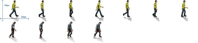
Now it’s time to give our character some life. I’ve provided a .png sprite with all of the necessary frames for our character’s walk cycle, first as a human, and then as a zombie. We’re going to write some JavaScript to cycle through these frames in our background image, based on the user’s scrolling. We’ll have it work forwards and backwards, which should give the piece a very game-like feel.
While it would be possible to have Skrollr animate the background image using data-* attributes, that would require us to write dozens of them, so instead we’ll write our own function. This will give us a little more flexibility, and obviously make the code a lot more maintainable. When we call skrollr.init() we’ll pass our function in as a parameter, specifically as the beforerender listener function, which is automatically called right before Skrollr renders each frame of animations. (You can read more about beforerender and Skrollr’s other options in the docs.) beforerender is passed an object with a property called curTop that will be especially helpful for us, as it contains the current scroll top offset, or in other words, the number of pixels the user has scrolled from the top of the page. We’ll use this to determine if we need to shift to the next or previous sprite in our background image, or if it is time to transition from human to zombie.
We’ll work on the walk cycle functionality first, and then add in the human to zombie transformation:
JavaScript:
var zombie = $('#zombie'),
	pLocs = [0, -250, -500, -750, -1000, -1250, -1500]
	curFrm = 0,
	lastStep=0;

skrollr.init({
	beforerender: function(o){
		// If the user has scrolled 50 pixels down
		// since the last time we shifted the background image,
		// we must be moving forward, so move to the next frame
		// in the spritesheet
		if(o.curTop > lastStep + 50) {
			if (curFrm>=6){ curFrm=-1; }
			zombie.css('background-position', pLocs[curFrm++] + 'px 0px');
			lastStep = o.curTop;
		// If the user has scrolled 50 pixels up,
		// we’re moving backwards, so move to the previous frame
		} else if(o.curTop < lastStep - 50) {
			if (curFrm<=0){ curFrm=7; }
			zombie.css('background-position', pLocs[curFrm--] + 'px 0px');
			lastStep = o.curTop;
		}
	}
});
zombie— reference to the div containing the characterpLocs— array of pixel locations of the left edge of each frame in our spritesheetcurFrm— holds the index of the current walk cycle frame in pLocslastStep— will hold the location of the last time we shifted the background image to reveal the next/previous frame
Fantastic! The difficult part is out of the way, and our man is now walking. Now only one step remains… the ZOMBIE TRANSFORMATION!
It may not be entirely true to The Walking Dead, but in this project the mode of zombie transformation for our character will be zombie school. Programmatically, the process is relatively painless. The frames for both walk cycles have been included in the same image, one stacked on top of another, so we simply need to bump up the background image positioning of #zombie 190 pixels when the user has scrolled to the point where the school passes over the character. In addition, because the zombie walk cycle is only 4 frames long (as opposed to 7 frames for the human walk cycle), we’ll need to make a few slight tweaks to the code that handles the walk cycle to make it a bit more flexible. The changes below are in bold.
JavaScript:
var zombie = $('#zombie'),
	pLocs = [0, -250, -500, -750, -1000, -1250, -1500],
	curFrm = 0,
	lastStep=0,
	// We need just a couple extra variables
	animationCycle, backPosY;

skrollr.init({
	beforerender: function(o){
		// If the user has scrolled less than 2800 pixels
		// from the top our character should be human,
		// otherwise… he’s turned.
		if(o.curTop < 2800) {
			animationCycle=7;
			backPosY= '0px';
		} else {
			animationCycle=4;
			backPosY= '-190px';
		}
		if(o.curTop > lastStep + 50) {
			if (curFrm>=animationCycle-1){ curFrm=-1; }
			zombie.css('background-position', pLocs[++curFrm] + 'px ' + backPosY);
			lastStep=o.curTop;
		} else if(o.curTop < lastStep - 50) {
			if (curFrm<=0){ curFrm=animationCycle; }
			zombie.css('background-position', pLocs[--curFrm] + 'px ' + backPosY);
			lastStep = o.curTop;
		}
	}
});
And that, my friends, is it. We now have a game-style parallax scrolling piece. Congrats! If you want to see a more polished version of it in the wild, then check out our Walking Dead demo.
Conclusion
We’ve obviously only just scraped the surface of what is possible with Skrollr, so I encourage you to read up on its many other nifty functions. There are some interesting things you can do, such as applying easing functions to your animations, using constants in combination with data attributes (great for code maintainability), or pulling keyframes entirely out of your markup and instead putting them in your CSS using Skrollr stylesheets.
To close, I’m going to hop up on my soapbox for a minute. Sometimes as web designers we feel like slaves to our medium — there are lots of limitations on the web, and lots of frustrating cross browser and cross device issues. At least being one who has worked in multiple mediums of design and development, I certainly feel that way sometimes. But there are also some very unique aspects in this browser-based medium of ours. For example, scrolling provides us with the opportunity to interact with users in different kinds of ways. In my opinion, we should take note of these unique properties, and always be searching for ways to fully leverage them to create great experiences.