Cross-Browser CSS box-shadows
Introduction
Drop shadows are often used in web and print design to give elements more depth. Creating drop shadows for the Web used to require multiple images, created in image editing software and then attached to the page as CSS background images. This approached worked, but as well as being labour-intensive in terms of creating the necessary graphics, it also required bloating your markup with nested divisions, as each element could only have one image attached to it.
CSS3 now provides us with the box-shadow property, which can be used to create multiple shadows on any block level element programmatically. This saves a lot of time spent in image editing software and removes those nasty nested divs, but it isn’t supported by Internet Explorer, so what is best for us to do?
In this article I will take you through a possible cross-browser solution — a box-shadow-based technique that also provides fallbacks for IE using IE-filters. I won’t discuss basic syntax or usage of this property, as it is already covered nicely in CSS3 borders, backgrounds and box-shadows.
Contents:
- Native support in browsers
- IE Filters
- Creating the drop shadow in IE and in other browsers
- Putting the example together
- Inner shadow
- Summary
Editor’s note: A few of you may be wondering what we are doing publishing an example that makes use of IE Filters? After all, they can slow down the page a lot, and they are a proprietary, IE-specific, non-open standard. CSS3 properties can handle a lot of the typical IE filter use cases. Well, this is great if you don’t particularly need the drop-shadows in IE (9 will support box-shadow, but 8 and below don’t), and/or want to add a JavaScript solution. But what if you absolutely need UI consistency across all browsers and want it to work without JavaScript? We absolutely do not condone widespread use of IE filters, but taking a pragmatic view, this is a good cross-browser solution for certain situations.
Native support in browsers
The CSS3 box-shadow property has good support across most modern browsers, although for cross-browser support you currently need to use all of the following variants of the property:
- For support in Opera and IE9 and higher you need to include the official W3C variant of the property, without prefixes:
box-shadow - For support in Firefox you need to include a
-moz-vendor-prefixed version:-moz-box-shadow - For support in WebKit-based browsers (eg Google Chrome and Apple Safari) you need to include a
-webkit-vendor-prefixed version:-webkit-box-shadow - IE up to version 8 does not support the property at all, so you will have to either settle for a site without the shadows or develop a workaround — my solution is covered below.
Browser support summary (as of July 2010):
| Internet Explorer | Firefox | Safari | Chrome | Opera | |
|---|---|---|---|---|---|
| Far past | 6.0 | 3.0 | 3.2 | 3.0 | 9.6 |
| Past | 7.0 | 3.5 | 4.0 | 4.0 | 10.10 |
| Present | 8.0 | 3.6 | 5.0 | 5.0 | 10.60 |
| Near future (late 2010) | |||||
| Future (beyond late 2010) | 9.0 | 4.0 | 5.* | 6.0 | 11.0 |
Data about IE9 taken from IE9 Developer Preview 3.
IE filters
I have learnt a lot about CSS-filters in IE recently. First of all, the blur filter allows you to blur elements in IE. Let’s start with a simple <div> element:
<div></div>

div {
	width:100px;
	height:100px;
	background:blue;
}
This looks like figure 1.

<div> element with fixed dimensionsWe can give this a blur radius of 5 pixels in IE using the following filter:
<div></div>

div {
	width:100px;
	height:100px;
	background:blue;
	filter:progid:DXImageTransform.Microsoft.Blur(pixelradius=5);
	-ms-filter:'progid:DXImageTransform.Microsoft.Blur(pixelradius=5)';
}
This gives the effect shown in figure 2 when applied to our example.

<div> element with a blur filter appliedCreating the drop shadow in IE and in other browsers
We can use this to create box-shadows in IE. I will include a “ghost” <div> element the same size as the content we want to put a shadow on. In browsers that do support box-shadow, it will be hidden off screen. In IE, it will be given a blur and positioned behind the content block to act as a drop shadow.
The drop shadow is made in modern browsers using the following HTML and CSS:
<div class="baseBlock"></div>

.baseBlock {
	width:100px;
	height:100px;
	background:#f9f;
	-webkit-box-shadow:10px 10px 5px #000;
	-moz-box-shadow:10px 10px 5px #000;
	box-shadow:10px 10px 5px #000;
}
To replicate this effect in IE, we include a special “ghost” <div> element, which is defined like so:
<div class="ieBlock"></div>

.ieBlock{
	height:100px;
	width:100px;
	background:#000;
	filter:progid:DXImageTransform.Microsoft.Blur(pixelradius=10);
	-ms-filter:"progid:DXImageTransform.Microsoft.Blur(pixelradius=10)";
}
The result of this is shown in figure 3:

Putting the example together
You can download a normal drop shadow example and an inner drop shadow example to get more of an idea of how this technique works. Below I have listed the full code for the basic technique. The first listing shows the HTML code for the example, with the main content and “ghost” <div> element put together:
<div class="baseBlock">
	<div class="baseBlockIn">
		Lorem ipsum dolor…
	</div>
	<div class="ieShadow"></div>
</div>
<div class="baseBlock"> is the container for the content block. <div class="baseBlockIn"> is the content container that we apply box-shadow to (this also helps fix problems with z-index in IE7). <div class="ieShadow"></div> is the “ghost” block that is blurred to create the shadow in IE.
The next section shows the first block of CSS, which is applied to every browser rendering the content:
/* CSS for all browsers */
.baseBlock{
	width:180px;
	-webkit-box-shadow:10px 10px 5px #444;
	-moz-box-shadow:10px 10px 5px #444;
	box-shadow:10px 10px 5px #444;
}

.baseBlockIn{
	/*	Content part specially separated
		for fixing problems with z-index in IE7 */
	padding:10px 15px;
	background:#f9f;
}

.ieShadow{
	display:none;
}
Here we are setting box-shadow for browsers that support it, and then hiding the IE shadow from non-IE browsers. The next code block shows the IE-only CSS — we are applying this using an IE conditional comment:
/*	CSS for IE versions 8 and below
	through conditional comments */
.baseBlock{
	position:relative;
	z-index:3;
}

.baseBlockIn{
	position:relative;
	/*	z-index for content must be bigger
		then z-index for shadow */
	z-index:4;
}

.ieShadow{
	display:block;
	position:absolute;
	z-index:2;
	top:5px;
	left:5px;
	right:-5px;
	bottom:-5px;
	filter:progid:DXImageTransform.Microsoft.Blur(pixelradius=5);
	-ms-filter:'progid:DXImageTransform.Microsoft.Blur(pixelradius=5)';
	background-color:#444;
}
Here baseBlock is used as the positioning context for the content and its drop shadow. The content — the .baseBlockIn <div> element — is given a larger z-index than the actual shadow — the .ieShadow <div> element. The latter is then positioned using absolute positioning, and the shadow created using a background colour and a blur filter.
There are some Peculiarities with how IE calculates the values of left, top, right and bottom, which affects the shadow <div> element:
leftvalue is calculated as X-offset minus blur value;topvalue is calculated as Y-offset minus blur value;rightvalue is calculated as blur value minus X-offset;bottomvalue is calculated as blur value minus Y-offset.
So in the code, we need to use positioning to emulate the shadow offsets created by box-shadow:10px 10px 5px #444;:
- The
leftvalue is calculated as X-offset minus blur value; 10 – 5 = 5 - The
topvalue is calculated as Y-offset minus blur value; 10 – 5 = 5 - The
rightvalue is calculated as blur value minus X-offset; 5 – 10 = –5 - The
bottomvalue is calculated as blur value minus Y-offset. 5 – 10 = –5
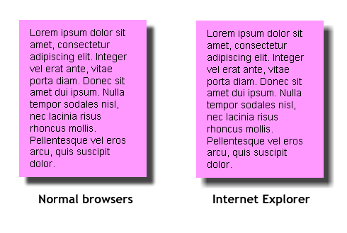
So, after all is said and done, the final result we are left with is similar to that shown in figure 4:
Inner shadow
We can use a similar technique to create inner shadows that work across browsers including IE. The differences are that overflow: hidden; is used to clip the shadow so that it doesn’t spill out of the container, and we also change the background-color in the conditional CSS to the same as the box-shadow colour in the main CSS. Again, let’s first start with the HTML:
<div class="shadowBoxOut">
	<div class="shadowBox">
	<div class="ieShadow"></div>
	<div class="content">
		Lorem ipsum dolor…
	</div>
	</div>
</div>
Next, the CSS that all browsers use is served:
/* CSS for all browsers */
.shadowBoxOut{
	border:1px solid #000;
	width:180px;
}

.shadowBox{
	background:#fff;
	padding:10px 15px;
	color:#000;
	-webkit-box-shadow:inset 30px 30px 20px #888;
	-moz-box-shadow:inset 30px 30px 20px #888;
	box-shadow:inset 30px 30px 20px #888;
}

.ieShadow{
	display:none;
}
And finally, the conditional CSS that only gets served to IE via a conditional comment:
/*	CSS for IE versions 8 and below
	through conditional comments */
.shadowBox{
	background:#888;
	/* Background colour changed to shadow colour */
	position:relative;
	overflow:hidden;
	zoom:1;
	border-right:1px solid transparent;
	/*	Fix problem with shadow overlay
		above content in IE8 */
	*border-right:0;
}

.ieShadow{
	display:block;
	position:absolute;
	top:10px;
	left:10px;
	bottom:-10px;
	right:-10px;
	background:#fff;
	/*	Here must be set of base
		layer background color */
	filter:progid:DXImageTransform.Microsoft.Blur(pixelradius=20);
	-ms-filter:'progid:DXImageTransform.Microsoft.Blur(pixelradius=20)';
}

.content{
	position:relative;
}
Again, the same peculiarities of calculating values of left, top, right, bottom in the shadow <div> element in IE apply in this situation.
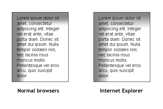
The code above gives us the rendering shown in figure 5.
Summary
In this article we have walked through a cross-browser solution for creating drop shadows on block level elements, based on box-shadow and using IE filters to provide IE support. It provides drop shadows for:
- Apple Safari 3+
- Google Chrome 2+
- Microsoft Internet Explorer 7+
- Mozilla Firefox 3.5+
- Opera 10.50+
The advantages of this approach are:
- It uses no images, meaning less messing around in image editing software, less HTTP requests and better performance;
- There is no JavaScript needed;
- You can set any shadow color you like.
One disadvantage is that using combinations of top/bottom properties and left/right properties is not supported by IE6, therefore this technique will not work reliably in that browser, unless you are applying it to elements with fixed height. In this case you can make it work in IE6 by swapping out top/bottom for top/height and left/right for left/width.