CSS3 Borders, Backgrounds and Boxes
Introduction
In this article, we will showcase some examples made using the new properties in the W3C’s CSS3 Backgrounds and Borders specification. We recommend using Opera 11 or later to view these examples in their full glory.
background-clipbackground-origin- Multiple background images
background-attachment- updated
backgroundshorthand box-shadowbox-decoration-breakborder-radiusborder-image
background-clip
The first CSS3 property that we’ll introduce is background-clip. This property is used to determine whether the background image extends into the border or not.
There are two options, the default border-box and padding-box. When border-box is used, the background image will extend to the border and will therefore show up behind the border, as in Figure 1. The other option is padding-box which means the background image won’t stretch to the border. The image will simply appear until the edge of the padding, as shown in Figure 2.
background-clip:border-boxbackground-clip:border-boxbackground-clip:padding-boxbackground-clip:padding-boxIn essence, padding-box clips the background image to the padding box while border-box clips the background image to the border. Screenshots of background-clip and background-origin show you how it looks if your browser does not support this CSS3 property.
Note that Gecko still uses their vendor prefix: -moz-background-clip. Gecko is also using the old property value without the -box suffix. Therefore, instead of padding-box, Gecko uses padding for the same effect. These issues have been fixed in the latest nightlies of Firefox but have not yet reached a final release at the time of writing. The latest versions of WebKit now support these properties without the prefix.
background-origin
The background-origin property is used to determine how the background-position of a background in a certain box is calculated.
When you position a background image, background-origin allows you to specify your starting point. The default padding-box positions the background image relative to the outer edge of the padding (inner edge of the border), whereas border-box positions the background image relative to the outer edge of the border. There is also the value content-box which, not surprisingly, positions the background image relative to the outer edge of the content (inner edge of the padding).
For example, a background image positioned 10 pixels from the left and top will show in the following positions using the different values for background-origin:
background-origin:border-boxbackground-origin:border-boxbackground-origin:padding-boxbackground-origin:padding-boxbackground-clip:padding-box and background-origin:border-boxbackground-clip:padding-box and background-origin:border-boxbackground-clip:padding-box and background-origin:padding-boxbackground-clip:padding-box and background-origin:padding-boxIf your browser does not support this feature yet, you can take a look at the background-clip and background-origin screenshots.
Daniel Davis has another example and explanation of CSS3 background-clip and background-origin.
Similar to background-clip, Gecko still uses its prefix for background-origin. Gecko is also using the old property value without the -box suffix. Instead of padding-box, Gecko uses padding for the same effect. These issues have been fixed in the latest nightlies of Firefox but have not yet reached a final release at the time of writing.
Multiple background images
CSS3 allows multiple backgrounds on a single element. This is done by defining multiple background images. You can achieve the effect using either the background-image or shorthand background properties.
Example 1
In the first example, we show you how to merge three background images into one using the background property.


By defining the background images in order, they overlap each other. The W3C spec says:
The first image in the list is the layer closest to the user, the next one is painted behind the first, and so on. The background color, if present, is painted below all of the other layers. Note that the
border-imageproperties can also define a background image, which, if present, is painted on top of the background created by the background properties.
You can view the multiple background image example here. The results can be seen in figure 8.

background:
	url(rose.png) no-repeat 150px -20px,
	url(driedrose.png) no-repeat,
	url(fieldsky.jpg) no-repeat;
Example 2
Alternatively, you can use the background-image property to create a background with multiple images.
In this second example we show you how to create the sliding doors technique using only background-image. This time there’s no need for extra nested blocks. Together with background-repeat and background-position, Patrick Lauke shows us how sliding door buttons are created using multiple background images.
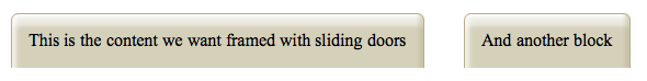
background-image:url(left.png), url(right.png), url(main.png);
background-repeat:no-repeat, no-repeat, repeat-x;
background-position:left top, right top, left top;
background-attachment
The background-attachment property determines if a background image is fixed or scrolls with the rest of the page. It happens when we define how a background image is attached to a viewport. Background images can be fixed to a viewport or can scroll along with the element or with its contents via local.
See Vadim Makeev’s background-attachment demo. He has created three sections to demonstrate how fixed, scroll and local are affected when we scroll the viewport and the full document.
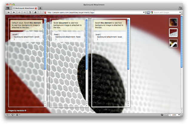
background-attachment exampleThe local value for background-attachment is new in the W3C’s CSS3 border and background specification. At the time of writing, it is not yet supported in public releases of Firefox.
Updated background shorthand
Starting with Opera 11, it is possible to specify the new CSS3 background properties in the background shorthand. This includes background-size, background-clip and background-origin.
There are a few things to be aware of when using the new background shorthand. If only one box value is specified both background-clip and background-origin are set to this value. If two are specified then the first is used for the origin and the second is used for the clip. As both background-position and background-size accept length and percentage values, a forward slash / needs to be present before the first background-size value. Finally, if specifying multiple background images, only the final image can specify a background-color.
In the following demo the background shorthand has been used to specify three images to illustrate the CSS box model. All values have been specified, even if they are the same as the default, to show how they can be defined. Each image has a different background-origin to place the image in the border box, padding box and content box respectively.
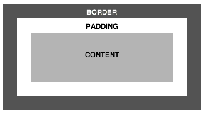
background shorthand, including various CSS3 propertiesSee the background shorthand demo in action.
The background shorthand used is as follows:
background:
	url(content.svgz) no-repeat left top / 200px 70px scroll content-box content-box,
	url(padding.svgz) no-repeat left top / 240px 110px scroll padding-box padding-box,
	url(border.svgz) no-repeat left top / 280px 150px scroll border-box border-box white;
box-shadow
Box shadow allows shadow effects on elements. This property takes several values:
- The first value indicates the horizontal offset of the shadow. You can use a negative value to put the shadow to the left of your box.
- The second value indicates the vertical offset. You can use a negative value to put the shadow above your box
- The third value is the blur radius. The bigger the value, the more blurred it is.
Additionally, you can give the shadow color, spread and offset values. Let’s look at some examples:
box-shadow:10px 10px 20px #000box-shadow:10px 10px 1px #000;
box-shadow:10px 10px 20px #FE2E2E;
border-radius:20px;
box-shadow:20px 20px 10px 10px;
box-shadow:-10px -10px 20px inset;
To check whether you’re looking at the correct box-shadow implementation, please see the CSS3 box-shadow screenshots and example here.
Example
If you like a kick in your tea, add some box-shadow, transforms, transitions, RGBa, query selectors and :lang(). Enjoy the steaming hot CSS3 box-shadow effects by Vadim Makeev.
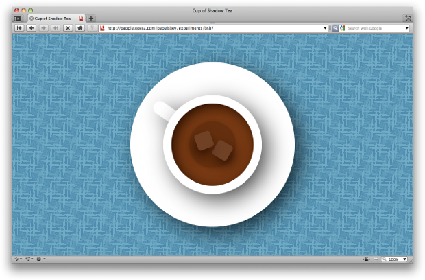
box-shadow and other CSS3 effectsThe box-shadow property only works on Gecko and WebKit with a -moz- and -webkit- prefix, respectively.
box-decoration-break
When laying out content in CSS, boxes can be broken into two or more pieces in a number of ways; in paged media such a print content is broken into page boxes when an element flows onto another page, when using CSS Multi-column layout a box is broken when flowing from one column to the next, and for inline elements an inline box is broken into line boxes when flowing from one line to the next.
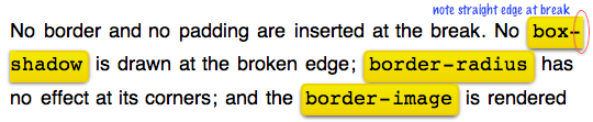
The box-decoration-break property allows you to define how these boxes behave. The slice value is the default value and behaves as if you do not specify the property or it is not supported. Properties such as border-radius, box-shadow, border and padding are not applied where the box breaks. The edge will be straight as if there was no special decoration, almost as if you cut the box cleanly into pieces, and places the pieces in position, such as the next line, page or column. See figure 13 for a visual demonstration of inline blocks with box-decoration-break:slice applied.
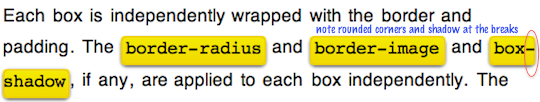
box-decoration-break:slice applied to inline elements. This is default behaviourThe clone value applies the padding, border, border-radius, -o-border-image and box-shadow to each box independently. This means that where the box breaks, such as at the start and end of a line, the border, border-radius and so on will be drawn, so that it looks like each box is its own element. If a background image is applied and set to no-repeat, it will be drawn once for each box See figure 14 for a visual demonstration of inline blocks with box-decoration-break:clone applied.
box-decoration-break:clone applied to inline elements. Note how the border-radius and box-shadow is applied at the end and start of the lineCheck out the box-decoration-break demo in Opera 10.60 or above to see this in action.
border-radius
The highly-awaited border-radius has arrived! We can now create rounded corners for our elements, just like the ones below.
border-radius is the shorthand for:
border-top-left-radiusborder-bottom-left-radiusborder-top-right-radiusborder-bottom-right-radius
Let’s dive into some examples.
border-radius:25px;
border-bottom-left-radius:40px;
border-bottom-right-radius:40px;
border-bottom-left-radius:40px;
border-bottom-right-radius:40px;
border-top-left-radius:10px;
border-top-right-radius:10px;
border-bottom-right-radius:120px;
border-radius:120px 20px;
border-radius:120px / 20px;
border-radius:30px;
background:url(japanese-tile.jpg);
To check whether your browser supports border-radius correctly you can compare the original border-radius example with the border-radius screenshots. Patrick Lauke and Vadim Makeev have created a border-radius picker that helps you to generate a one-liner border-radius code.
Gecko still uses the border-radius properties with the -moz- prefix. Gecko also has an alternative syntax for non-shorthand values. These issues have been fixed in the latest nightlies of Firefox but have not yet reached a final release at the time of writing.
-o-border-image
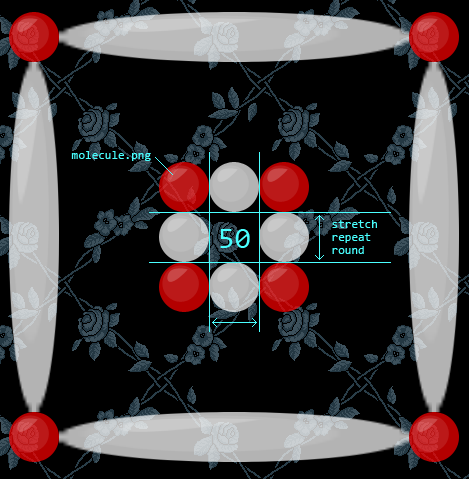
Using the -o-border-image property, you can use an image to act as an element’s border. Images can be set to stretch, repeat or round.
repeatborder-image:url(molecule.png) 50 stretch;
stretch-o-border-image:url(molecule.png) 50 stretch;
The stretch and repeat values are fairly self-explanatory. The round value still repeats the image but compresses the image to fit the element width without showing only parts of the image itself. See Vadim Makeev’s animated showcase of CSS3’s border-image to get an idea of how the effect works. Screenshots are shown below.
-o-border-image:stretch screenshot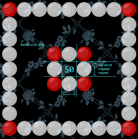
-o-border-image:repeat screenshotOpera 11.50 requires the -o- prefix for border-image. While the CSS3 Backgrounds and Borders module is fairly stable, the border-image spec has changed substantially since we implemented it (including becoming a short hand for a number of individual border-image properties). As such we introduced the vendor prefix until the implementation matches the new spec. It is no longer supported prefixless at the time of writing. WebKit and Gecko also currently require their respective prefix.
Conclusion
We hope you enjoyed reading and trying out these new CSS3 implementations. They run in Opera 11+, and other standards-aware browsers.
Credit goes to Daniel Davis and Patrick Lauke for their wonderful demos, and David Storey for his suggestions, ideas, and updating this article for the new features found in Opera 11.