CSS3 Linear Gradients
Article update: 12th December 2012
The article has been updated to cover the gradient syntax covered in the (at the time of writing) latest Image Values and Replaced Content Module Level 3 specification, dated June 12th 2012.
Introduction
For as long as we can remember, we have used colour gradients on the Web to brighten things up, and add class to designs. If you want to create a fantastic looking button, panel, gauge, progress bar or other UI feature, a gradient is the way to go.
Up until now, we have always used repeated background images to create gradient effects. The CSS is simple, and creating a gradient using Photoshop, Fireworks, or another graphics tool is not hard. However, doing it this way is rather inflexible, given that if you want to vary the colour scheme or other features of the gradient, you need to go back to your graphics tool and create another image! Wouldn’t it be better if you had complete control over the gradients using CSS?
CSS3 comes to the rescue with the CSS Image Values and Replaced Content Module Level 3: part of this module defines CSS gradients, which allow us to create any gradients we want using only CSS. In this article I will explore how to use linear and repeated linear gradients, which are supported across Opera 11.10+, Firefox 3.6+, Safari 5.0.3+ and Chrome 7+.
Note: Radial gradients are covered in the article CSS3 radial gradients.
Creating gradients
I have included some simple examples for you to play with in my linear gradients demo. Download this example and play with different values as you read through the sections below.
To create a basic linear gradient, you need to provide a start point and an end point, like so:
background-image:linear-gradient(
	rgb(100, 100, 100),
	rgb(200, 200, 200)
);
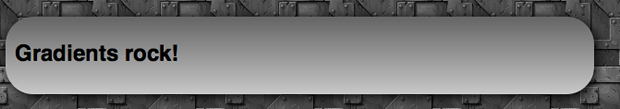
This creates a simple gradient that goes from a darker grey at the top of the element the gradient is applied to, down to a lighter grey at the bottom, as seen in Figure 1. Here I’m applying it to a simple article element, but you can apply it to any block level element you like.
So why is the gradient applied as a background image and not a background colour, which might seem more appropriate? This is because of flexibility and familiarity. We always used to apply gradients using CSS background images, plus now you can use CSS multiple backgrounds to layer multiple images on top of gradients, if you like.
Because gradients are background images however, you can — and should — specify a fall back background-color. Imagine your page has a white background, and you have a button with a gradient background and white text above it. To prevent older browsers displaying white text on the white background of the page, you can give your button a background-color:gray so the text remains readable and the button doesn’t appear broken. In modern browsers, the gradient will hide the color.
Varying the gradient angle
In the first example, we didn’t specify any kind of direction or angle, and the gradient went from the top of the block to the bottom. This is the default, and is equivalent to writing this:
background-image:linear-gradient(
	to bottom,
	rgb(100, 100, 100),
	rgb(200, 200, 200)
);
So the angle goes at the start of the gradient information, separated by the colours by a comma. You can make the gradient go across the block from the top, bottom, left or right, by changing the keywords appropriately as seen in Figure 2.
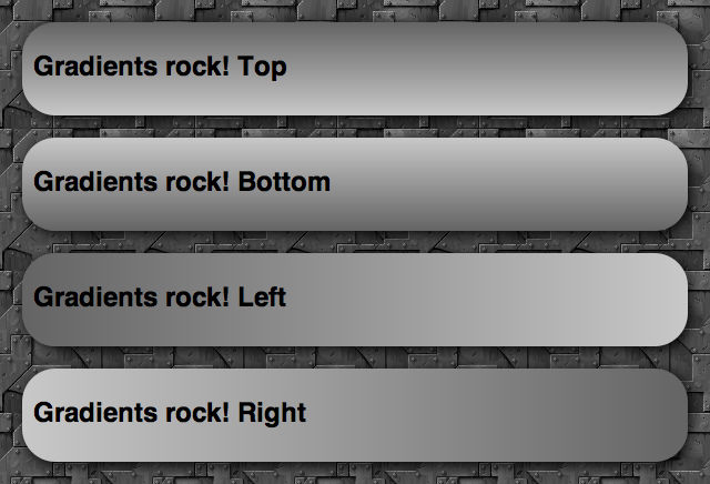
to bottom, to top, to right, and to left, respectivelyYou can also use values of to top left, to top right, to bottom left and to bottom right: these make the gradient start from that corner, and run towards the opposite corner of the box.
The other way to set gradient angles is through a degree value, for example:
background-image:linear-gradient(
	0deg,
	rgb(100, 100, 100),
	rgb(200, 200, 200)
);
0degis equivalent toto top.90degis equivalent toto right.180degis equivalent toto bottom.270degis equivalent toto left.360degbrings you back toto topagain.
This gives you a good idea of how the degree values work. Try playing with them and seeing what you come up with!
Colour stops
A colour stop is simply a position along the gradient that has a specific colour. You can specify as many colours as you like along a gradient, and the browser will calculate all the colours between those stops. Let’s look at an example, which creates a gradient running from top left to bottom right, changing colour from a lighter red to a darker red:
background-image:linear-gradient(
	to bottom right,
	rgb(255, 0, 0),
	rgb(150, 0, 0)
);
This is equivalent to the following:
background-image:linear-gradient(
	to bottom right,
	rgb(255, 0, 0) 0%,
	rgb(150, 0, 0) 100%
);
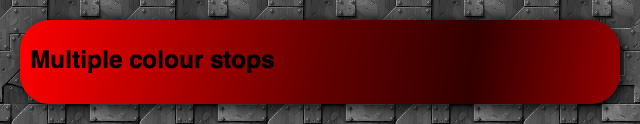
So here we have one colour stop at 0%, and one at 100% of the way across the block the element is applied to. But there is no point writing these, as this is the default. Instead, it is a lot more useful to add colour stops in between the start and end. For example:
background-image:linear-gradient(
	to bottom right,
	rgb(255, 0, 0),
	rgb(100, 0, 0) 50%,
	rgb(50, 0, 0) 75%,
	rgb(150, 0, 0)
);
Here we are starting with a really light red, then going to a darker red at 50%, an even darker one at 75%, and then then a slightly lighter one at 100%. This gives us the result shown in Figure 3.
Doing it with percentages is really cool, and shows how versatile CSS gradients are. The conditions in the code will always be true, even if you have a liquid layout where the box the gradient is applied to changes width or height as the browser window is resized.
If you want to, you can also use pixels or other fixed CSS unit values instead of the percentages. For example:
background-image:linear-gradient(
	to bottom right,
	rgb(255, 0, 0),
	rgb(100, 0, 0) 100px,
	rgb(50, 0, 0) 200px,
	rgb(150, 0, 0)
);
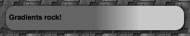
This means the colour stops will always occur 100 and 200 pixels from the start of the gradient, regardless of how much you resize the browser window. You can vary the position of the beginning and end colour stops as well if you want — they don’t need to appear at the beginning and end of the block! In such a case, the space before the beginning colour stop will be a solid block of that colour, and the space after the end colour stop will be a solid block of the end colour. For example, try something like:
background-image:linear-gradient(
	90deg,
	rgb(100, 100, 100) 50%,
	rgb(200, 200, 200) 75%
);
and you’ll get something like Figure 4.
Transparency gradients
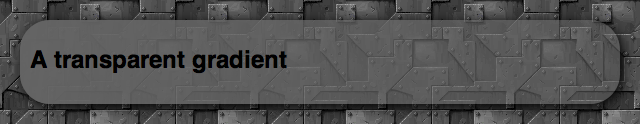
One really cool technique to consider is varying the alpha channel value of the colour along the gradient. For example:
background-image:linear-gradient(
	to right,
	rgba(100, 100, 100, 1),
	rgba(100, 100, 100, 0.5)
);
Here we are using RGBA colours, with an alpha channel value of 1 at the start of the gradient, and 0.5 at the end. I’ve not touched the red, green and blue values, but I’ve ended up with a really cool effect as shown in Figure 5.
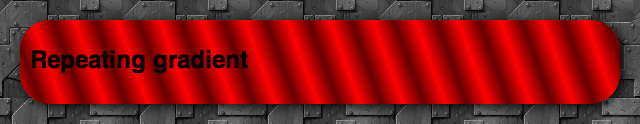
Repeating linear gradients
Instead of linear-gradient, you can use repeating-linear-gradient: this takes the colour stop values and repeats them endlessly. It doesn’t make much sense to do this with percentage values, but with pixels and other units, it can create some cool effects. For example:
background-image:repeating-linear-gradient(
	70deg,
	rgb(255, 0, 0),
	rgb(100, 0, 0) 20px,
	rgb(255, 0, 0) 40px
);
Here we are starting at a bright full red, moving to a darker red after 20 pixels, then moving back to the full red at 40 pixels. Then, because it is a repeating gradient, it keeps repeating this pattern until the end of the block. The above example looks something like Figure 6.
Browser support, and old syntax
Note that the newest versions of Opera, Firefox and IE all support the current syntax of linear gradients, without prefixes, while WebKit-based browsers still require the old syntax. For compatibility with older browser versions and WebKit versions, you should consider including vendor prefixes versions of the property, all including the older syntax. This is basically the same, except:
- The direction keywords are the opposite way round and don’t include the word
to. Sotop leftis equivalent toto bottom right,bottomis equivalent toto top, and so on. - When signifying angles for directions, you need to do some recalculation, as
0degused to mean horizontal towards the right (equivalent toleft), and now it means vertical and upwards (equivalent toto top).
So a full cross browser block that also looks after older browser syntax would something like this:
background-image:-webkit-repeating-linear-gradient(20deg, rgb(255,0,0), rgb(100,0,0) 20px, rgb(255,0,0) 40px);
background-image:-moz-repeating-linear-gradient(20deg, rgb(255,0,0), rgb(100,0,0) 20px, rgb(255,0,0) 40px);
background-image:-ms-repeating-linear-gradient(20deg, rgb(255,0,0), rgb(100,0,0) 20px, rgb(255,0,0) 40px);
background-image:-o-repeating-linear-gradient(20deg, rgb(255,0,0), rgb(100,0,0) 20px, rgb(255,0,0) 40px);
background-image:repeating-linear-gradient(70deg, rgb(255,0,0), rgb(100,0,0) 20px, rgb(255,0,0) 40px);
More involved examples
My Opera team mate Vadim Makeev over in St. Petersburg has created a really cool Apple button menu example, see Figure 7.
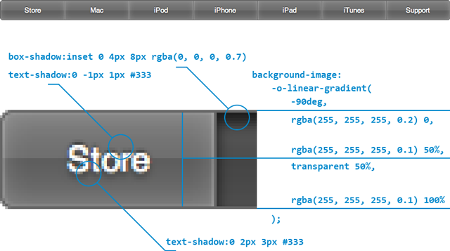
The explanation he includes below the example makes it very easy to see how it’s done, and this just shows what cool things we can now produce with nothing but a little bit of CSS sparkle.
Lea Verou also has some nice CSS gradient examples available, such as Checkerboard, striped & other background patterns with CSS3 gradients and Beveled corners & negative border-radius with CSS3 gradients.
Summary
And thus ends our brief foray into linear CSS gradients. I hope you found this article useful, and I’m looking forward to seeing how you make use of this great new feature!