Introduction to hCard — Part 2: Styling hCards
Introduction
In the first part of this tutorial, I showed you the basics of the hCard microformat — what it is, how you implement on in HTML, and what tools are available to extract tem form web pages. Now that we know how to create hCards, let’s go through a couple of examples that demonstrate how we might style hCards with CSS to make them fit into the visual design of a web page.
Download the full code for the examples in this article.
Our first example — styling an existing hCard
For our first example, let’s work on the contact card created in the first part of the article, making it a bit more visually appealing with some CSS. First let’s add a few more fields to the hCard we made last time (to give our card some more hooks to hang style information on):
<div class="vcard">
	<div class="fn">Tripper, Jack</div>
	<div class="n">Jack Tripper</div>
	<div class="org">Jack’s Bistro</div>
	<div class="adr">
		<div class="street-address">834 Ocean Vista Ave.</div>
		<span class="locality">Santa Monica</span>,
		<span class="region">CA</span>,
		<span class="postal-code">90405</span>
	</div>
	<p><div class="tel">(310) 444-8444</div></p>
	<p><div class="email"><a href="mailto:jackthetripper@@example.com">jackthetripper@example.com</a></div></p>
</div><!-- end vcard-->
Notice how we’ve split up the n and fn properties: For the purposes of this example, we want to separate the title of our contact card (or “formatted name”) from the rest of the card. The formatted name – Tripper, Jack – will label our contact card, while the n name field — Jack Tripper — will be included in the body of the card.
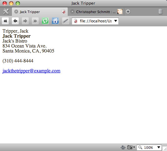
The default rendering of the contact information is shown in Figure 1.
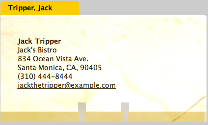
This contact card is, at best functional, but uninspiring. Let’s style this hCard with some CSS and make it a bit more impressive. There are many directions we could take here, but we are going to take inspiration from the old-fashioned Rolodex card. When we’re finished the hCard will be styled as seen in Figure 2:
Check out the first example running live.
Enhancing the HTML and adding basic spacing
So, how do we make our card this hip and retro? Let’s begin by marking up our HTML a bit more. We first want to style the “title” of the hCard, which will make the “tab” of the Rolodex card stand out separate from the rest of it. So we first wrap the portion of the hCard that is separate from this title in its own div:
<div class="vcard">
	<div class="fn">Tripper, Jack</div>
	<div class="vcardmain">
		<div class="n">Jack Tripper</div>
		<div class="org">Jack’s Bistro</div>
		<div class="adr">
			<div class="street-address">834 Ocean Vista Ave.</div>
			<span class="locality">Santa Monica</span>,
			<span class="region">CA</span>,
			<span class="postal-code">90405</span>
		</div>
		<p><div class="tel">(310) 444-8444</div></p>
		<p><div class="email"><a href="mailto:jackthetripper@@example.com">jackthetripper@example.com</a></div></p>
	</div><!-- end vcardmain-->
</div><!-- end vcard-->
Next, we add dimensions to this element, and a background color:
.vcardmain {
	width: 350px;
	padding: 45px 35px 65px 35px;
	background: #fff;
}
Our contact card now looks like Figure 3.
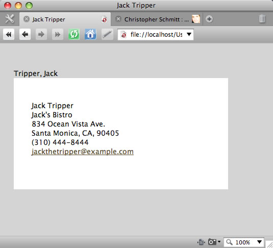
Note that we’ve added quite a bit of vertical space at the bottom of the card. The importance of this comes later.
Creating the Rolodex “tab”
Next we want to create the Rolodex “tab” — we do this by targeting the class:
.fn {
	width: 140px;
	padding: 5px 5px 5px 15px;
	background-color: #fc0;
	font-weight: bold;
	color: #000;
}
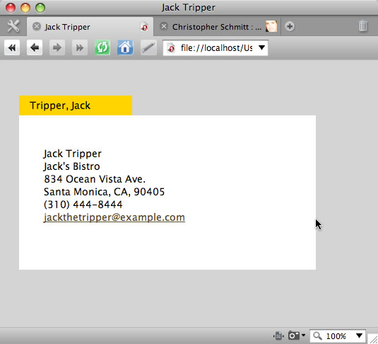
This rule sets the dimensions of the div, makes the font bold so it stands out, and sets the background and font colour. Now our contact card is beginning to look more like a Rolodex card – check out Figure 4.
Adding rounded corners
Now it’s time to start adding more subtle design touches – we will now add some rounded corners of our elements to make it look more like an authentic Rolodex card. There are many techniques for creating rounded corners, but here we will use Alessandro Fulciniti’s Nifty Corners Cube, which includes a piece of JavaScript that rounds element corners for you. I won’t go into detail about how it works, but I will run quickly through steps needed to get it to work for our hCard.
After downloading the script and placing it in the same directory as the hCard HTML file, link the script to your page by placing the following in the HTML head:
<script src="niftycube.js"></script>
Then, add the following script to the heading as well:
<script>
	window.onload = function() {
		Nifty('div.fn', 'large top');
		Nifty('div.vcardmain', 'large tr');
	};
</script>
This first targets the fn div (the top tab) and gives it large round corners on the top. The second line of the script targets the vcardmain div (the element making up the body of the card), and rounds the top right (tr) corner of the element.
After putting this in place, our card now looks like Figure 5.

The background image
It’s getting close! All that remains now is to add the background image for the card, including the card text, and the Rolodex hole punches at the bottom. Recall that we included a large amount of padding at the bottom of the vcardmain div. We did this so that we would have room to add this graphic element.
The image is 420 pixels wide, the same width as the div - see Figure 6.

So, the background image is attached to the vcardmain div using the following CSS rule:
.vcardmain {
	width: 350px;
	padding: 45px 35px 65px 35px;
	background: #fff url(images/background.jpg) no-repeat bottom;
}
Note that we put this image at the bottom of the card, and set the background-repeat property to no-repeat.
This finishes our hCard! Of course, this is only one of the many possibilities for styling a contact card. You may opt for a more subdued aesthetic when designing your own cards, but this is certainly a fun example to show off what can be done.
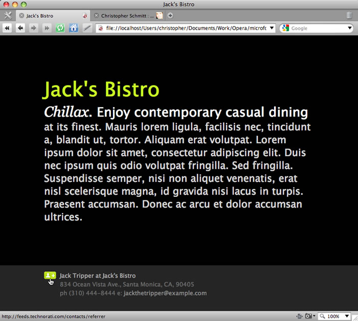
A second example — hCard footer
For our second example, let’s create something a bit more understated. Footers are a very common design treatment for Web pages, and a fair amount of site information gets posted there, including contact information. A footer is a perfect place to put an hCard!
Our second footer example - as shown in Figure 7 - not only has an hCard in the footer, it also contains a link that allows a user to download our hCard as a working vCard, which can then be easily imported into their address book application (eg Mac Address Book or Microsoft Outlook on Windows.)
Check out the second example running live.
The footer HTML
Let’s look at the HTML for the footer portion of this web page:
<div id="footer">
<a href="http://feeds.technorati.com/contacts/referrer"></a>
<div class="vcard">
<span class="title"><span class="fn">Jack Tripper</span> at <span class="org">Jack’s Bistro</span></span>
<div class="adr">
<span class="street-address">834 Ocean Vista Ave.</span>, <span class="locality">Santa Monica</span>,
<span class="region">CA</span>, <span class="postal-code">90405</span>
</div><!--end adr-->
ph <span class="tel">(310) 444-8444</span> e: <span class="email"><a
href="mailto:jackthetripper@@example.com">jackthetripper@example.com</a></span>
</div><!-- end vcard-->
</div><!--end footer-->
Apart from a few minor changes, the hCard portion of the footer is very similar to the first example. Note however the link above the hCard that wraps a small icon image. When the user clicks on this icon, any hCards included in the markup is converted to a vCard, which can then be downloaded onto the user’s computer.
The link points to a free service offered by Technorati that performs this very specific and very useful task. To make use of this hCard to vCard converter, we just need to include a link that points to http://feeds.technorati.com/contacts/referrer — Technorati does the rest! So long as a valid hCard is included in the web page, Technorati finds the hCard content, converts it, and makes it available to the user for download.
Styling the footer
Now we’ve set up our download icon and hCard, we just need to add a bit of CSS to style these elements within the footer. Once we’ve set the desired colors and general font styles in the footer, we just need to add the following:
#footer .title {
	color: #999;
}

#footer img {
	float: left;
}

#footer .vcard {
	margin-left: 38px;
}
The first selector targets the “title” (or first line) of the hCard, and colors the text so that it stands out from the rest of the contact information. The icon image is floated to the left, and the vcard class, which wraps the entire hCard, is given a wide left-hand margin to make room for the icon so that it doesn’t wrap around the image.
Summary
In this article, we have created a couple of simple, elegant method to make your contact information more easily accessible to your users. With a bit of semantic markup, we’ve made it very simple for the user to import your contact data into their favorite address book application.