How to Do Photoshop-Like Effects in SVG
Introduction
I came across this nice Photoshop tutorial the other day. Looking at this, and the other tutorials available there made me want to try to recreate the same effects, not using Photoshop however, just SVG. Read on for my take on the above tutorial. To better follow the steps in my article I recommend reading these side by side.
Note that the original version of this article can be found on my blog.
Step 1
Create a new SVG file, and create an svg canvas like so:
<svg xmlns="http://www.w3.org/2000/svg"
	xmlns:xlink="http://www.w3.org/1999/xlink"
	viewBox="0 0 600 335">
</svg>
By adding a viewBox with the dimensions 600 x 335 you can get the SVG to scale to whatever size you want later on.
Step 2
Next, create some rectangles and a couple of gradients by adding the following inside the svg element.
<linearGradient id="lowergrad" x1="0" y1="1" x2="0" y2="0">
	<stop stop-color="#000000" offset="0"/>
	<stop stop-color="#0c0c0c" offset="1"/>
</linearGradient>
<linearGradient id="uppergrad" x1="0" y1="1" x2="0" y2="0">
	<stop stop-color="#35393d" offset="0"/>
	<stop stop-color="#787b7d" offset="1"/>
</linearGradient>
<g id="bar" fill-opacity="0.9" shape-rendering="optimizeSpeed">
	<rect id="upperbar" y="285"
		width="600" height="25"
		fill="url(#uppergrad)"/>
	<rect id="lowerbar" y="310"
		width="600" height="25"
		fill="url(#lowergrad)"/>
</g>
The linear gradients gradiate between the first color and the second color at a 90 degree angle. 90 degree angles (sometimes called straight angles) are easily translated into a vector from point (x1, y1) to point (x2, y2), where the value 1 maps to 100% of the boundingbox of the shape that gets painted with the gradient, and the value 0 maps of course to 0% of the same. I’ve added the gradient stops with the colors we want, and set the offsets. The offset is where the color will be mapped onto the gradient vector specified with x1, y1, x2 and y2.
In case you didn’t follow the above, here is a little more explanation — any angle can be written as the vector (x1,y1) to (x2,y2) (the angle is the angle of that vector). When you create a gradient the default is that the boundingbox of the shape that the gradient is applied to is used. In other words, the attributes x1,x2,y1,y2 are mapped onto the bounding box that gradient is used on as follows: (x,y)=(0,0) means the upper left corner, (x,y)=(1,1) means the bottom right corner. The gradient vector is the line between the start point (x1,y1) and the end point (x2,y2).
The g element groups the rects together and provides a shape-rendering property to disable anti-aliasing so that the edges stay crisp. I’ve also added the 90% opacity to the g layer. Then for each of the rects I’ve assigned a fill. Note that for better performance you should use fill-opacity instead of opacity.
Step 3
Next, create a few straight lines — add these inside the g element from the previous step, just below the closing
<line stroke-width="2" stroke="#9fa2a4"
	x1="0" y1="287" x2="600" y2="287"/>
<line stroke-width="2" stroke="#484b4d"
	x1="0" y1="285" x2="600" y2="285"/>
One thing to note here is that line elements have no fill, only stroke. Everything else should be fairly easy to understand; you draw the line between (x1,y1) and (x2,y2).
Step 4
Now it’s time to draw the divider line (the vertical line in between each button) — add this as follows:
<linearGradient id="upperdivider" x1="0" y1="1" x2="0" y2="0">
	<stop stop-color="#676a6d" offset="0"/>
	<stop stop-color="#afb1b2" offset="1"/>
</linearGradient>
This first bit of code adds the gradient that goes on the bottom half of the divider. Next you need to add the following, which allows you to reuse the divider multiple times.
<g id="divider">
	<line y1="290" y2="310" stroke-width="2" stroke="url(#upperdivider)"/>
	<line y1="310" y2="330" stroke-width="2" stroke="#43474b"/>
</g>
…
<use xlink:href="#divider" x="100"/>
<use xlink:href="#divider" x="200"/>
<use xlink:href="#divider" x="300"/>
<use xlink:href="#divider" x="400"/>
<use xlink:href="#divider" x="500"/>
The divider group once is defined once, then re-used multiple times with the use element. This is really convenient — if you change the look of the divider, all of the use instances will be updated too. It’s possible to optimize here by creating filled rects instead of lines, and using only one gradient. In this particular example that’s hardly the most time consuming part of the SVG anyway, so I’ve opted to leave it as close to the original tutorial as possible.
Step 5
Next, you will add the text for the navigation buttons, styling it with common properties, and align it. Add the following CSS to your document:
<style>
	.links {
		font-family: Arial, sans-serif;
		font-size: 16px;
		text-anchor: middle;
		fill: white;
		text-rendering: optimizeLegibility;
		}
</style>
…
<text class="links" x="150" y="316.5">Blog</text>
<text class="links" x="250" y="316.5">About</text>
<text class="links" x="350" y="316.5">Tutorials</text>
<text class="links" x="450" y="316.5">Contact</text>
Instead of rewriting stuff multiple times you’ve assigned a class attribute and then used CSS to style all the text. We’ve used Arial with a sans-serif fallback, and set the size and aligned the text using the text-anchor property. The text will be aligned around the x coordinate we specified. I’ve added a text-rendering property to make the text look more readable on viewers that support it. Usually it means that the text renders a bit more crisp.
Step 6
To add the background image, simply drop in an image element, as follows.
<image xlink:href="background.jpg"
	width="100%" height="100%"
	preserveAspectRatio="xMinYMid slice"/>
The image should cover the entire canvas so we specify width and height as 100%. Note that you can also write width="600" height=335" since you have defined the coordinate system using the viewBox attribute on the root <svg> element (in step #1). Finally you add a preserveAspectRatio attribute so that if we decide to add a graphic that can’t be scaled to fit exactly, it will still fill the canvas without being stretched. Now you can simply make the image point at an svg document instead whenever you want, meaning that you get a fully scalable result.
Step 7
To get the blurred rounded rect you have to use SVG filters and clipping. Start by defining the clip region, which is a rounded rect, inside a <defs> element, to be called upon as necessary:
<clipPath id="clip">
	<rect id="blurrect" x="-10%" y="25%"
		width="55%" height="60%" rx="20"/>
</clipPath>
This is as simple as drawing any other SVG graphic; the only difference is that you have wrapped it inside a clipPath element. This defines a clipping region that we can use on other elements. Next, create the blur filter as follows, again adding it inside the defs element:
<filter id="blurpane">
	<feImage xlink:href="#blurrect" result="clip"/>
	<feGaussianBlur stdDeviation="2"
		in="SourceGraphic" result="blur"/>
	<feComposite operator="in" in="blur" in2="clip"/>
	<feComposite mode="over" in="blur"
		in2="SourceGraphic" result="final"/>
</filter>
The filter is doing the following:
- It takes the rounded rect and defines it as the input to the filter, naming it
clip - Next it blurs the background image (using keyword
SourceGraphic) and names itblur - It then composites the two together, effectively clipping the result
- Last, it composites the result of the previous step with the original background image
Here’s how to create the clip-path and filter — create this below the code in the previous step:
<g filter="url(#dropshadow)">
	<g clip-path="url(#clip)">
		<image image-rendering="optimizeSpeed"
			xlink:href="background.jpg" width="100%" height="100%"
			preserveAspectRatio="xMidYMidslice"
			filter="url(#blurpane)"/>
	</g>
</g>
The clip-path refers to the clipPath element created in a previous step. It is applied to a group so that the filter can first be applied to the image. If the clip-path is applied to the image then the filter result may get clipped — sometimes that’s desirable, sometimes not. The entire group here should be added directly after the background image in the previous step. This is the “blurred rounded rect” effect and you want it drawn on top of the background image. Note that it looks like the background image is drawn twice, but this is actually intentional. By clipping the filter a bit we get better performance since that means we won’t have to recalculate the filter as often when we do the hover effect (it means that we can draw the cheaper non-filtered image on those parts that are outside of the blurred rect). image-rendering="optimizeSpeed" means you can draw the image quicker, and since we’re filtering it won’t show anyway. preserveAspectRatio="xMidYMid slice" means you can use a background image that is not of the same aspect ratio as the svg area that you need; this means you can cover the entire area defined by the width and height attributes.
The image element uses the filter (filter="url(#blurpane)"), and the group clips the result to the shape defined by (clip-path="url(#clip)"); finally we add a drop shadow to that end result — (filter="url(#dropshadow)").
Now you have added a drop-shadow filter on the blurred region. The drop-shadow filter has its filter region limited so that we don’t spend time filtering regions that aren’t interesting; add this below the previous snippet:
<filter id="dropshadow" x="0" y="30%" width="60%" height="54%">
	<feGaussianBlur in="SourceAlpha" stdDeviation="5"/>
	<feComponentTransfer>
		<feFuncA type="linear" slope="0.5"/>
	</feComponentTransfer>
	<feMerge>
		<feMergeNode/>
		<feMergeNode in="SourceGraphic"/>
	</feMerge>
</filter>
The drop-shadow filter works like so:
- It takes the alpha channel of the graphic that the filter is applied to and blurs it
- It then makes it more transparent using a component transfer on the alpha channel
- Next it merges the blurred slightly more transparent shadow with the original graphic (SourceGraphic)
A tip for visualising the filter region is to make a simple filter and use a feFlood element to fill the region. It should furthermore be noted that I make no claims that the provided filter-chains are optimal — in fact I’m fairly sure they could be improved.
Step 8
Add some text for the blurred rect, plus a gradient fill and a drop-shadow like so (add this below the previous code snippet)
<text id="header" font-family="Arial" font-weight="900"
	font-size="40" x="20" y="55%" fill="url(#textgrad)"
	filter="url(#smallblur)">SVG Example</text>
<text id="subheader" font-family="Arial" font-size="20"
	font-style="italic" x="20" y="75%" fill="url(#textgrad)"
	filter="url(#smallblur)">Shiny new web standards for all!</text>
The gradient used here is nothing special, but I’ve included it here anyway along with a drop-shadow filter that we also apply on the text. Add the following snippet inside the defs element.
<linearGradient id="textgrad" x1="0" y1="1" x2="0" y2="0">
	<stop stop-color="#afb1b2" offset="0"/>
	<stop stop-color="white" offset="0.5"/>
</linearGradient>
<filter id="smallblur" height="140%">
	<feGaussianBlur in="SourceAlpha" stdDeviation="1.5"/>
	<feOffset dx="2" dy="2"/>
	<feMerge>
		<feMergeNode/>
		<feMergeNode in="SourceGraphic"/>
	</feMerge>
</filter>
Step 9
Now you will add the hover effect, a blurred ellipse with clipping. This reuses some of the code you already have. Add the following at the bottom of the file:
<ellipse id="hover" cx="250" cy="340"
	rx="100" ry="30" style="display:none"/>
There is a bit of style on the element itself here, but most of it is going to be put into the style element — add the following in just before the closing style tag:
#hover {
	fill:#5c94c5;
	filter:url(#bigblur);
	clip-path:url(#cliphover);
	}
The ellipse is clipped to the rect shape of the buttons.
Step 10
Since this is SVG you can play with the result easily, and add dynamic effects. Add a hover effect by adding the following script block inside the defs element:
<script>
	function setHover(val) {
		document.getElementById('hover').style.display = 'inline';
		document.getElementById('hover').cx.baseVal.value = val + 50;
		document.getElementById('hoverrect').x.baseVal.value = val - 1;
	}
	function hideHover() {
		document.getElementById('hover').style.display = 'none';
	}
</script>
These functions are called on mouseover on a few interesting areas. These areas can be defined separately from the actual graphic elements used (in this case the text labels). I’ve defined a few rectangles for regions that looked suitable for the mouseover effects. The rects are invisible and exist just to listen to the events.
Final result
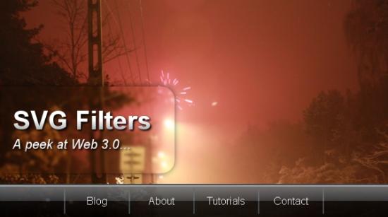
Note that if your browser doesn’t support the SVG Basic 1.1 filters the example will display a static JPEG image instead. This uses a two-level fallback. First off it’s using <object data="menu.svg"><img src="fallback.jpg"></object>, then it’s also adding a switch inside the SVG so that an SVG browser will show the same JPEG if the 1.1 basic filter feature is not supported. Here’s what that looks like:
<switch>
	<g requiredFeatures="http://www.w3.org/TR/SVG11/feature#BasicFilter">
		<-- Main content of the svg -->
	</g>
	<image xlink:href="fallback.jpg"/>
</switch>
As of this moment, this only seems to be supported completely in Opera. Firefox 3 renders it strangely, and Safari and IE doesn’t support it at all.
You can click here and select Ctrl/Right-click > Source to see the source of the SVG.
Update, January 2010: There is also a Firefox-friendly version of the menu available, which doesn’t have the same dependencies as the original.
Conclusion
Using modern web standards it’s easy to create nice effects that were previously only possible in photo editing applications, such as Photoshop. By using stylesheets we can change the look of the graphics without needing to go back to an image editing application to re-color and re-export them and then fix all links to point to the new images. Instead we might decide that blue was a sucky color, and just add a style rule for changing that to a fresh lime green. No other changes required! If you don’t fancy learning SVG techniques like this, then fine — while you’re still stuck doing all that Photoshopping I’ll just grab a beer in the mean time while the browser does the job for me instead! Mmm… beer.
Some other small points to consider are that it is also really easy to update changes in the text content, without having to mess with the graphics; also, being vector-based, it resizes very comfortably, without distortion.
