The New Start Page: Working With the Theme Overlay
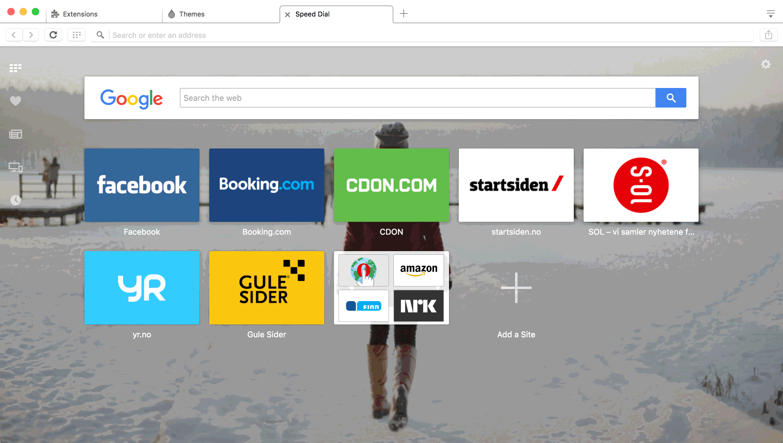
From Opera 36 onwards, the start page will have a brand new look. It introduces various design improvements, right from the placement of key icons, to the sizes of the speed dial tiles. As part of this, it also introduces a translucent gray overlay on themes.
Previously the title text for speed dial tiles was always having a white background and black text. The new design got rid of it, and overall speed dial tiles look much better. However, a side-effect of it was that reading the text totally depended on the background picture in the theme.
A solution to this is to introduce a subtle gray translucent overlay on themes and have the title text color for speed dial tiles white by default. We wanted to create a design that could work for any image you would try (or already have installed), meaning that even busy images would work just well and you will have a good experience using the new start page. While this solves the legibility issue by making the text very easy to read, some theme designers might want to not have this overlay, depending on their preference.
So we have introduced an option for theme authors to specify whether an overlay should be applied to their theme or not. If they choose not to apply an overlay on their theme images, then they can do so, and even specify the color for the speed dial text and other icons on the start page. This gives greater control in the hands of the theme creator.
What does this mean for theme designers?
As a theme designer, you have two choices. If you want the background image to work with the overlay, then there is nothing extra you need to do. The overlay is applied by default, and all the text and icons will be white in color to contrast with the overlay (which gives it a nice contrast, making sure its readable) so no extra work needed there.
However, if you would like the overlay not to be applied to your background image, you now have the option to do so. However, keep in mind that in this case, you have the responsibility to make sure that all text and icons are properly visible to users.
Disabling the theme overlay
We have introduced a new option in the Persona.ini file. You can now use Use Overlay to tell Opera whether to have it enabled or not. If you don’t want the overlay, simply write
[Start Page]
Background					= background.jpg
Position					= center
Use Overlay					= false;
This will disable the overlay.
Making text and icons readable
Once you disable the overlay, it is up to you to make sure all the text and icons are having proper contrast and are readable by the user. For this, the existing option of Title Text Color will matter a lot.
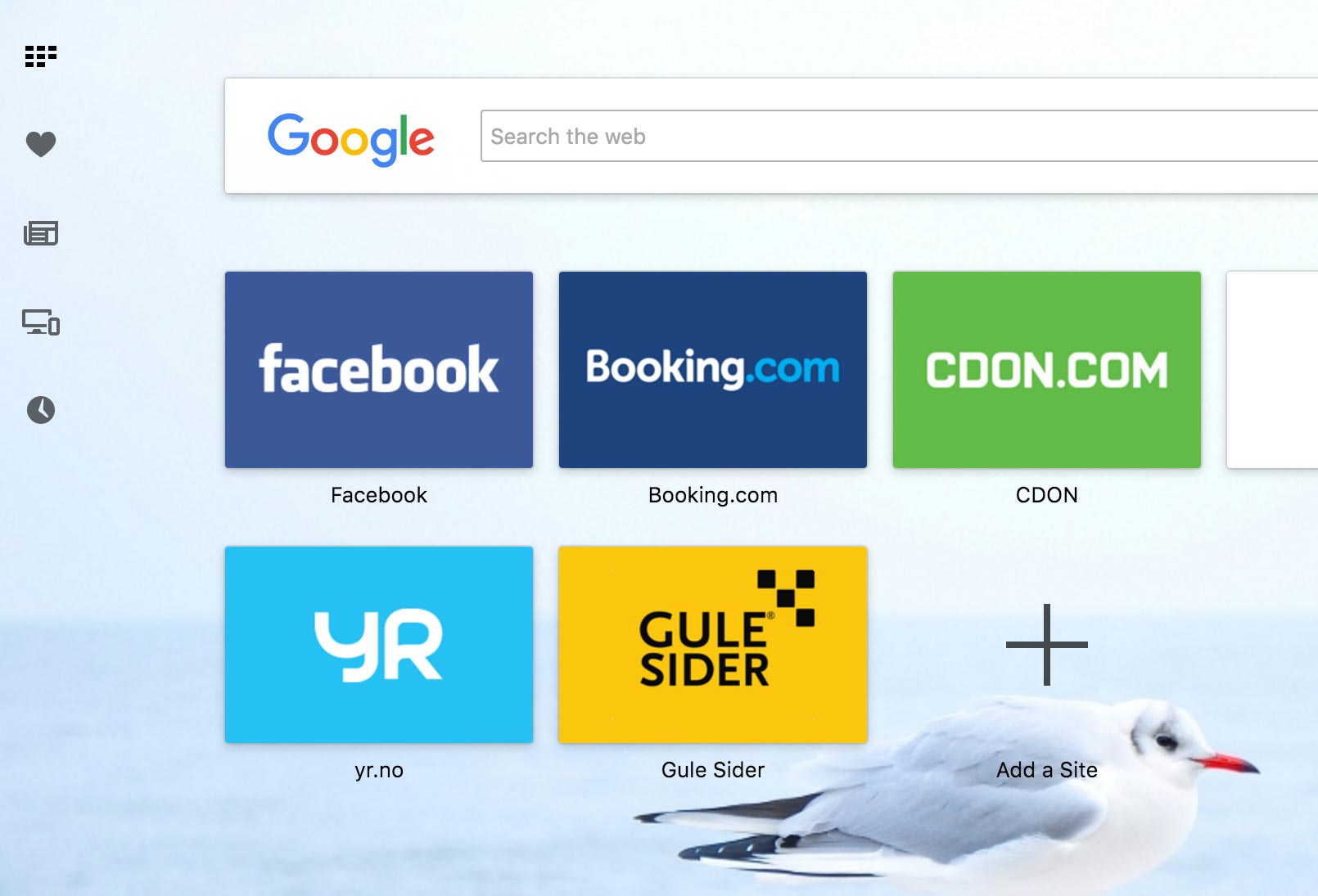
Let’s take the example of the following of a theme with a disabled overlay.

Now the image here is very light and provides very little contrast to the text, which is white in color. Let’s make it dark to provide it proper contrast. Let’s write the following:
[Start Page]
Background				= background.jpg
Position				= center
Use Overlay				= false;
Title Text Color		= #000000
This gives us the following result:
This is much better. However, you could go ahead and provide more style which matches the color scheme (rather than the standard black) while still providing good contrast. Let’s change the text color like so:
Title Text Color = #ff0000
This results in the image having good contrast and matching the color scheme.
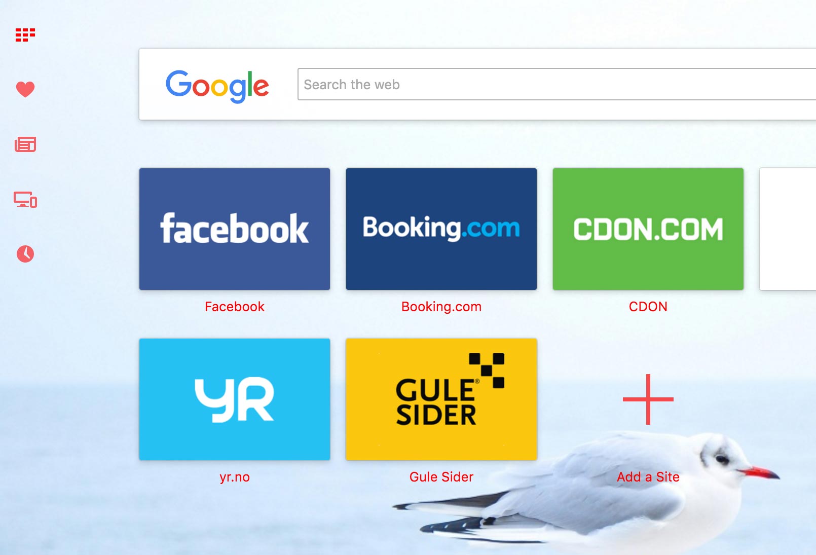
Keep in mind that, despite the name, using Title Text Color will affect the color of not just the text, but also the icons on the start page.
In the above image, you can notice how the icons have the color applied to it too.
Conclusion
The new start page for Opera features an all new re-design. This features a new overlay for images which makes it work with a lot of images, even busy images, while still providing readability for users. Theme designers get greater control over how they want their background images to be displayed.
If they want to disable the overlay, they can use Use Overlay = false in the Persona.ini file. If overlay is disabled, then theme designers should keep in mind readability for text and icons on the start page by specifying an appropriate color for them using Title Text Color in the Persona.ini file.