devicePixelRatio in Opera Mobile
I've been enjoying PPK's recent look at devicePixelRatio and More about devicePixelRatio, but one detail in the latter post caught my eye: discussing the devicePixelRatio on the Galaxy Nexus, he notes that Opera Mobile goes for a ratio of 2.25, while other browser use a ratio of 2.
By default, the devicePixelRatio in Opera Mobile is determined by the device's reported resolution:
| Resolution | devicePixelRatio | |
|---|---|---|
| < 170dpi | 1 | |
| 170-200dpi | 1.25 | |
| 200-260dpi | 1.5 | |
| 260-280dpi | 1.75 | |
| 280-320dpi | 2 | |
| > 320dpi | 2.25 |
Now, the Galaxy Nexus has a nominal resolution of 316dpi, so it should actually end up with a devicePixelRatio of 2...but perhaps the OS is reporting it as 320dpi, triggering the slightly higher ratio.
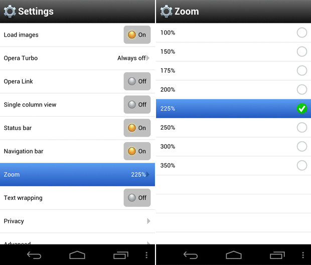
One aspect that seems to be unique to Opera Mobile, however, is that users can change the devicePixelRatio through the Zoom preference in the browser's Settings.
On regular (non-mobile-optimised) sites, this setting affects how closely the browser zooms into the page when double-tapping. At the same time, though, changing this setting also changes the devicePixelRatio, to make this preference more effective on mobile-optimised sites. For instance, setting the preference to 175% globally sets the devicePixelRatio to 1.75. This will obviously have an effect on sites that use viewport meta to set things like width=device-width and sites that use pixel-ratio-specific Media Queries, as the reported values will now be different.
Note that this global Zoom setting is different from a user's normal zoom/pinch-zoom action – in those situations, devicePixelRatio doesn't change.