
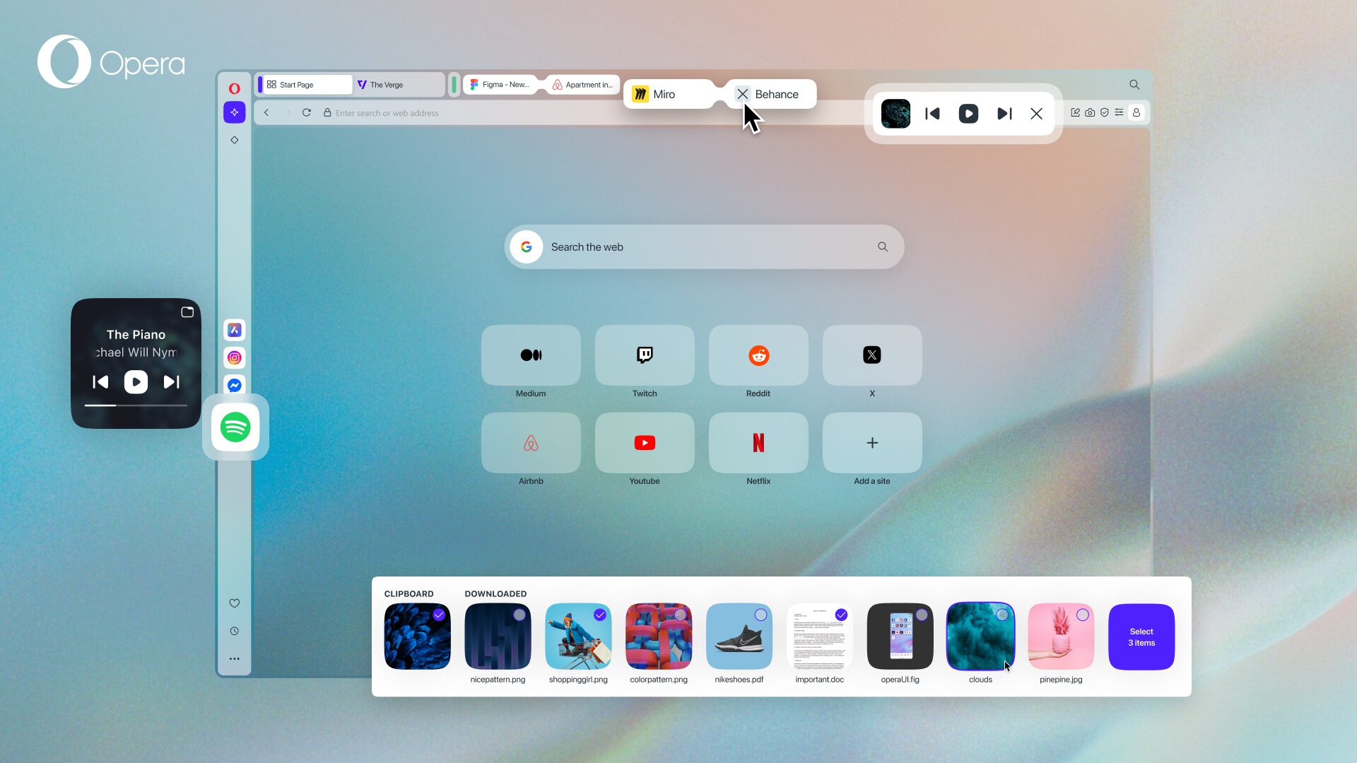
Opera adds user-requested features to Opera One: Music Player access in toolbar, improvements to Split Screen, and a revamp to...


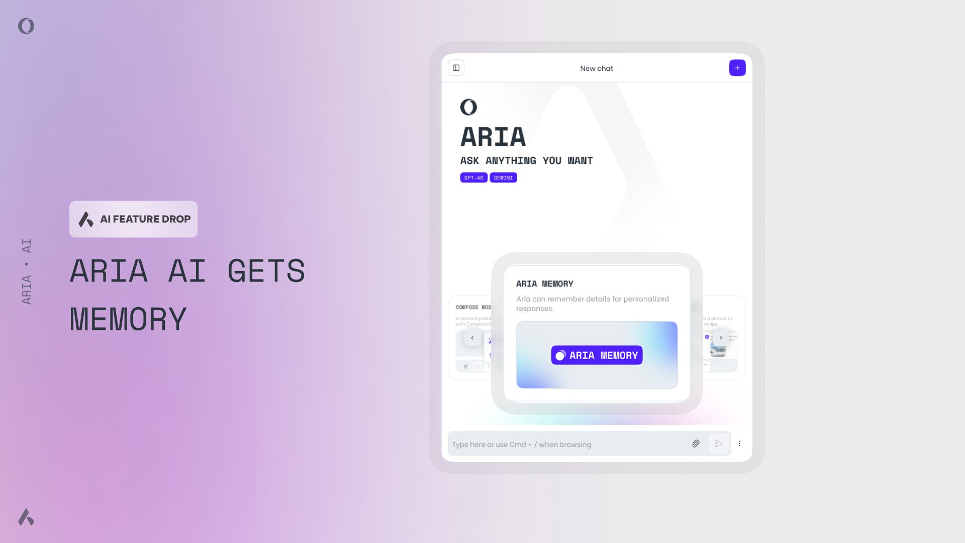
Opera's free VPN, Ad blocker, and Flow file sharing. Just a few of the must-have features built into Opera for faster, smoother and distraction-free browsing designed to improve your online experience.