Beautiful UI Styling With CSS3 text-shadow, box-shadow, and border-radius
Introduction
Previous articles have covered the basics of CSS3 transitions and 2D transforms and CSS3 borders, backgrounds and box-shadows; refer to those articles if you need to read up on the basics of using these properties.
This article takes things further, showing how to use these properties to create beautiful UI elements without the use of any images, JavaScript or Flash. This last line highlights the real beauty of CSS3 — many of its features are designed to save you time otherwise spent creating and updating graphics in Photoshop. It makes techniques such as drop shadows and animated UI elements accessible to web developers and designers without scripting smarts or mad Photoshop skills.
Contents:
Where can they be applied?
Support for these CSS3 features was introduced in Opera 10.50, and you’ll also be able to rely on most of them in the latest versions of Firefox, Safari and Chrome.
| Browser | Opera 10.50 | Opera 10.10 | Safari 4.x | Chrome 4/5 | Firefox 3.6 | IE 8 and below |
|---|---|---|---|---|---|---|
text-shadow | Yes | Yes | Yes | Yes | Yes | No |
border-radius | Yes | No | Yes | Yes | Yes | No |
box-shadow | Yes | No | Yes | Yes | Yes | No |
box-shadow:inset | Yes | No | No | Yes | Yes | No |
Of course, in the real web most of us are stuck having to support Internet Explorer, which doesn’t yet support any of these properties. The best place to use them is therefore an environment where you can control what browser will be used. A prime example here is Opera Widgets, which run on the Opera core engine and therefore include modern browser features. An intranet is also a good example, so long as you can get your staff or society members all using a good modern browser!
For the Web at large, however, all is not lost. These properties degrade gracefully in browsers that don’t support them, meaning that you’ll still get a usable UI, even if it doesn’t look as hot. You can also provide fallbacks for browsers that don’t support these properties, for example using IE conditional comments.
It is really a matter of who your target audience is, and providing an acceptable user experience to them. This does not necessarily mean the same user experience for all web users.
One thing to be aware of is that using a lot of box-shadow properties is expensive in terms of processing — especially when you make heavy use of blurring. If you want to use these effects in your Widgets and web applications, you should test carefully, especially on mobile and other lower-power devices as they start to support these features.
Take 1: Buttons
One of the most obvious applications of these properties is to simplify button design. Todays buttons are typically created in a particular pattern. The button usually has rounded corners. Light comes from the top, and shadow appears below the button. Often there is a glass shine effect on the button itself. The text is often white (or another light colour) with a dark drop shadow, or vice-versa, to give an embossed or raised effect. Let’s now go through some examples of what is possible, starting with a step-by-step button construction.
Stage 1: The basic shape
First up, I’ll set a basic core colour for the button, and give it rounded corners:
button {
	padding:5px 30px;
	border:none;
	border-radius:4px;
	background-color:lightgreen;
	}
The result of this code is as follows:
Stage 2: Adding some light and shadow
Next I’ll add two box shadows to the button, to make it look 3D: raised up, and slightly convex on top:
button {
	padding:5px 30px;
	border:none;
	border-radius:4px;
	background:lightgreen;
	-webkit-box-shadow:
		inset 0 5px 10px yellow,
		0 1px 1px green;
	-moz-box-shadow:
		inset 0 5px 10px yellow,
		0 1px 1px green;
	box-shadow:
		inset 0 5px 10px yellow,
		0 1px 1px green;
	}
Here’s the result of this addition:
Stage 3: Adding text style
Finally, I’ll give the button text a more fitting colour, and give it a lighter drop shadow to make it look slightly embossed:
button {
	padding:5px 30px;
	border:none;
	border-radius:4px;
	-webkit-box-shadow:
		inset 0 5px 10px yellow,
		0 1px 1px green;
	-moz-box-shadow:
		inset 0 5px 10px yellow,
		0 1px 1px green;
	box-shadow:
		inset 0 5px 10px yellow,
		0 1px 1px green;
	background:lightgreen;
	color:darkgreen;
	text-shadow:0 1px 1px lightyellow;
}
Here is our final result:
Variation 1: A red button
button {
	padding:5px 30px;
	border:1px solid maroon;
	border-radius:4px;
	-webkit-box-shadow:
		inset 0 1px 3px pink,
		inset 0 -5px 15px maroon,
		0 2px 1px black;
	-moz-box-shadow:
		inset 0 1px 3px pink,
		inset 0 -5px 15px maroon,
		0 2px 1px black;
	box-shadow:
		inset 0 1px 3px pink,
		inset 0 -5px 15px maroon,
		0 2px 1px black;
	background-color:red;
	color:white;
	text-shadow:0 1px 1px black;
	}
The result is as follows:
Variation 2: A Twitter-esque button
button{
	padding:5px 30px;
	border:1px solid #8ec1da;
	border-radius:4px;
	-webkit-box-shadow:
		inset 0 1px 3px #fff,
		inset 0 -15px #cbe6f2,
		0 0 3px #8ec1da;
	-moz-box-shadow:
		inset 0 1px 3px #fff,
		inset 0 -15px #cbe6f2,
		0 0 3px #8ec1da;
	box-shadow:
		inset 0 1px 3px #fff,
		inset 0 -15px #cbe6f2,
		0 0 3px #8ec1da;
	background-color:#ddeef6;
	color:#3985a8;
	text-shadow:0 1px #fff;
	}
This looks like so:
Variation 3: A download button
button {
	padding:5px 30px;
	border:1px solid darkgreen;
	border-radius:4px;
	-webkit-box-shadow:
		inset 1px 6px 12px lightgreen,
		inset -1px -10px 5px darkgreen,
		1px 2px 1px black;
	-moz-box-shadow:
		inset 1px 6px 12px lightgreen,
		inset -1px -10px 5px darkgreen,
		1px 2px 1px black;
	box-shadow:
		inset 1px 6px 12px lightgreen,
		inset -1px -10px 5px darkgreen,
		1px 2px 1px black;
	background-color:green;
	color: white;
	text-shadow: 1px 1px 1px black;
	}
This gives us the following result:
Take 2: Containing boxes
Another obvious use of these properties is to style containing boxes in UIs — the areas that contain your buttons, form fields, and other interactive application features. As before, I will go through a few examples to help fire up your creativity!
Box 1: Surf’s up
This is a blue box with some cyan highlights and a light drop shadow.
div {
	margin:10px;
	padding:0;
	width:100px;
	height:100px;
	-webkit-box-shadow:
		0 1px 5px #0061aa,
		inset 0 10px 20px #b6f9ff;
	-moz-box-shadow:
		0 1px 5px #0061aa,
		inset 0 10px 20px #b6f9ff;
	box-shadow:
		0 1px 5px #0061aa,
		inset 0 10px 20px #b6f9ff;
	background: #6fb2e5;
	}
Here is the result:
Box 2: Ghosted grey
In this case, the effect is obtained with creative use of an inner shadow.
div {
	margin:10px;
	padding:0;
	width:100px;
	height:100px;
	-webkit-box-shadow:
		8px 10px 10px rgba(0,0,0,0.5),
		inset 8px 10px 10px rgba(255,255,255,0.75);
	-moz-box-shadow:
		8px 10px 10px rgba(0,0,0,0.5),
		inset 8px 10px 10px rgba(255,255,255,0.75);
	box-shadow:
		8px 10px 10px rgba(0,0,0,0.5),
		inset 8px 10px 10px rgba(255,255,255,0.75);
	background:#ccc;
	}
This gives us the following effect:
Box 3: They call me Mr. Glass
Here I’ve applied rgba colours to the shadows, so most of this box is semi-transparent. I have added a second div around the first one with a repeating background pattern image applied to it, so you can appreciate the full extent of this effect.
div {
	margin:10px;
	padding:0;
	width:100px;
	height:100px;
	border:1px solid rgba(0,0,0,0.5);
	border-radius:10px 10px 2px 2px;
	-webkit-box-shadow:
		0 2px 6px rgba(0,0,0,0.5),
		inset 0 1px rgba(255,255,255,0.3),
		inset 0 10px rgba(255,255,255,0.2),
		inset 0 10px 20px rgba(255,255,255,0.25),
		inset 0 -15px 30px rgba(0,0,0,0.3);
	-moz-box-shadow:
		0 2px 6px rgba(0,0,0,0.5),
		inset 0 1px rgba(255,255,255,0.3),
		inset 0 10px rgba(255,255,255,0.2),
		inset 0 10px 20px rgba(255,255,255,0.25),
		inset 0 -15px 30px rgba(0,0,0,0.3);
	box-shadow:
		0 2px 6px rgba(0,0,0,0.5),
		inset 0 1px rgba(255,255,255,0.3),
		inset 0 10px rgba(255,255,255,0.2),
		inset 0 10px 20px rgba(255,255,255,0.25),
		inset 0 -15px 30px rgba(0,0,0,0.3);
	background:rgba(0,0,0,0.25);
	}
Here’s the result:
For more information on RGBa and HSLa colours, check out Molly Holzschlag’s article Color in Opera 10 — HSL, RGB and Alpha Transparency
Take 3: Advanced examples
Hopefully you are completely blown away by the power of the new CSS properties by now, but just in case I have prepared some more examples! Figures 1-3 show what the examples look like, and you can also use the links to see them running live.
Media player
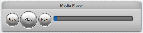
View the media player running live.
A certain phone home screen
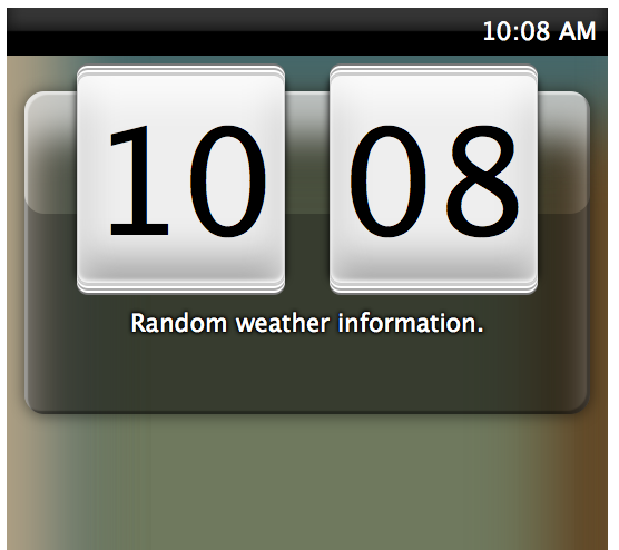
View the phone UI example running live.
A Windows desktop
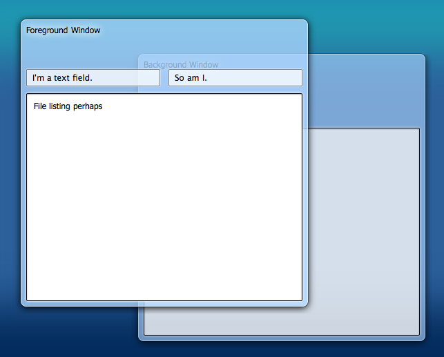
View the Windows desktop example running live.
Summary
This concludes our tour of some advanced UI effects, all created with CSS3 shadows and rounded corners — absolutely no images required. At Opera we’re pretty excited about having this functionality available, and hope you are as well — we look forward to seeing what you’ll create!