An Introduction to Meta Viewport and @viewport
Introduction
Support for the viewport meta tag in Opera’s mobile products has been around for quite some time, and from Opera Mobile 11 onward, we have made our viewport implementation more robust, added support for new mechanisms to deal with different screen densities, and included an implementation of our own CSS @viewport rule proposal. In addition, Opera Mini 6 and later now also comes with basic support for the viewport meta tag.
Update 27 May 2012: There is experimental support for -ms-viewport in Internet Explorer 10.
So, what better time than now to give you an introduction to the various viewport-related mechanisms you can use to optimize your site for mobile? Let’s get started!
Web page handling by mobile browsers
Recent generations of mobile browsers can render full web pages without a problem and scale them so they fit nicely inside the phone browser’s visible screen area or viewport — the user then can zoom in on areas of interest and pan around on the page using touch, keypad, trackball or other input, depending on the phone model.
Opera Mobile follows this logic as well: it renders a normal web page using a viewport width of 980px — think of it as pretending to be a desktop browser with an 980px window width. It then squeezes the resulting page rendering to fit nicely inside the actual viewport of the phone browser you are using.
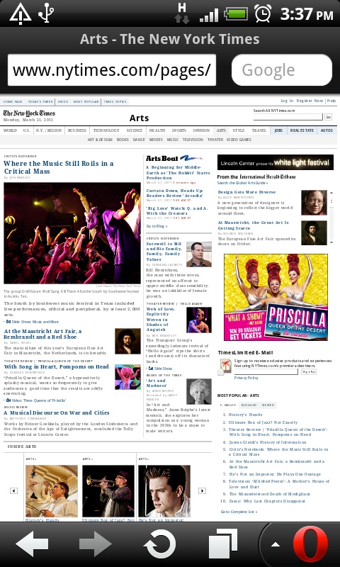
If the page loaded is wider than 980px, such as for instance www.nytimes.com (see Figure 1), Opera Mobile goes to some extra effort, making the viewport a little wider so as to make sure the parts that would otherwise fall out of the 980px are included as well. The result is then scaled down so the page fits nicely inside the available screen area.
For a lot of sites, this way of page handling and interaction is sufficient. However, there may be cases where you want to control the size and scaling of the page, for instance when you are making a mobile-optimized web app with a native feel. It is here that the viewport meta tag and the new @viewport rule come in handy: they enable you to override that default 980px viewport value, define a maximum viewport height, and more, allowing you to manipulate the browser’s display and zoom behavior as you please.
Viewport syntax
Overriding the default viewport can be done by including a viewport meta tag in the <head> section of your page. I’m including a somewhat complex example just to illustrate what the syntax looks like:
<meta name="viewport" content="width=320, initial-scale=0.5">
Alternatively — and this currently only works in Opera Mobile 11 and later, hence the -o- prefix — you can use the @viewport rule in your CSS. A translation of the example above would be as follows:
@-o-viewport {
	width: 320px;
	zoom: 0.5;
}
The above example and certain others in this article use CSS properties with an -o- prefix — for reasons of clarity and simplicity, we have not included other vendor prefixes. However, note that if you use these properties in a real-world website you should make sure to also include -webkit-, -moz- and -ms- prefixed properties, as well as a prefixless variant.
Looking at the above examples, it is worth pointing out that whereas the @viewport syntax is CSS, the viewport meta tag syntax is not CSS. This means for instance that you have to use commas as delimiters between viewport values, and not semicolons. Make sure you get this right, as semicolon delimiters may result in the viewport values being interpreted incorrectly or even discarded entirely, even although certain user-agents are forgiving.
Setting the viewport width
Now we’ll look in more detail at setting the viewport width.
Specific width
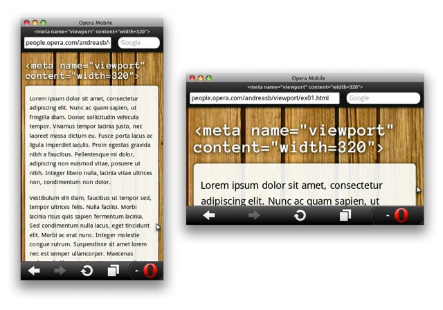
Let’s set some values. As a first example, we’ll set the viewport to be 320 pixels wide.
<meta name="viewport" content="width=320">
or alternatively,
@-o-viewport {
	width: 320px;
}
This setting will make the browser render the page on a canvas with a width of 320px, and then fit the result as neatly as possible inside the available screen area. If that area is 360px wide (see Figure 2), the content will be scaled up by a factor of 1.125; if it’s 240px wide, expect it to become smaller by a factor of 0.75.
It is worth pointing out that using a specific pixel value for the viewport offers a quick and easy way to optimize an existing, not too wide design for mobile viewing. For instance, if your page content is living inside a centered, 500 pixel-wide container you can set the viewport to be 500px, which will nicely blow up that container so as to make it fit inside the available screen area. If you need a bit more margin on the left and right, try a larger pixel value, e.g. 550px.
Device width
Alternatively, and this is our recommended practice, you can set the viewport width to be equal to the width of the device’s screen:
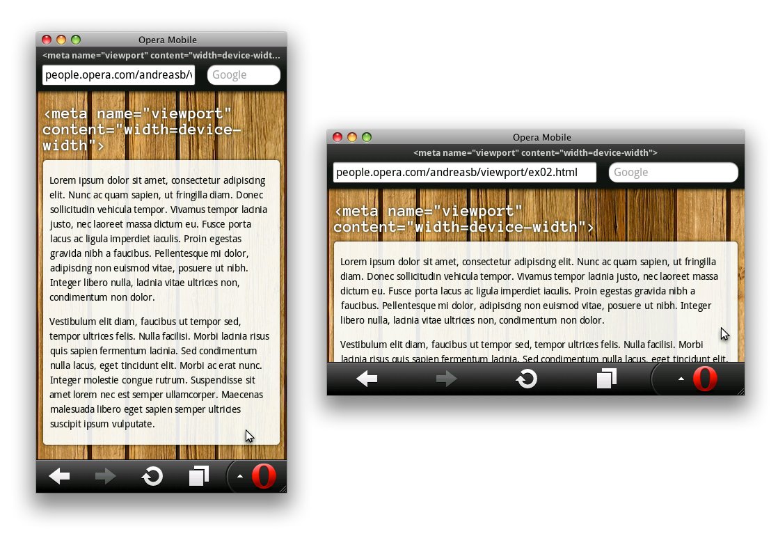
<meta name="viewport" content="width=device-width">
or in CSS,
@-o-viewport {
	width: device-width;
}
By using this setting, you basically tell the browser “No scaling needed, thank you very much. Just make the viewport as many pixels wide as the device screen width.” This means that if the device has a screen that is 360px wide, the viewport width will be 360px (see Figure 3); if it’s 480px, the viewport will be 480px, etc. To get an idea of what your site will look like when using this setting, you can simply resize your desktop browser window and try out different sizes: no scaling will occur of course, but that’s exactly the point.
When using this setting, you’ll want to use various liquid layout techniques and media queries, so as to make sure your site looks nice and adapts itself to varying screen sizes. We’ll look at how to combine viewport with media queries a bit later on.
device-width on a 360×600px screen in portrait and landscape orientationOther viewport properties
There are some other viewport properties you should be aware of: we’ll look at these now.
Viewport height
Similar to the width property, there is also a corresponding one for height settings. You can use it with specific pixel values, or with device-height. You won’t find yourself using the height property that often — it’s mostly useful for pages that should not pan, or else, only pan sideways, both of which occur relatively rarely.
In the following example, we limit the canvas effectively to the number of pixels shown by the browser window — panning is not possible at all:
<meta name="viewport" content="width=device-width, height=device-height">
or alternatively,
@-o-viewport {
	width: device-width;
	height: device-height;
}
Initial scale

In addition to the above, you may want to specify the initial zoom factor for the viewing area. If you want to set the viewport of your page to be equal to the device’s width and have it zoom in by default with a factor of 2 for example, this property will come in handy. The code for that would look as follows:
<meta name="viewport" content="width=device-width, initial-scale=2">
or alternatively,
@-o-viewport {
	width: device-width;
	zoom: 2;
}
Figure 4 shows what this would look like — although it is not a particularly practical demonstration of the possibilities the initial scale setting has to offer, the underlying point should be clear: content is blown up with a factor of 2 upon first load.
It is worth pointing out here that once one of the values for viewport width, height or initial scale is set, the browser will automatically infer values for the properties that are not set. For example, when setting the width to device-width, the initial scale value is automatically considered to be 1, and vice versa. It is only when you want to use a non-inferred value that it makes sense to set more than one property.
Scaling constraints
If you want to, you can constrain how much the user can zoom in or out by setting the maximum-scale and minimum-scale properties. For example:
<meta name="viewport" content="width=device-width, maximum-scale=2, minimum-scale=0.5">
or alternatively,
@-o-viewport {
	width: device-width;
	max-zoom: 2;
	min-zoom: 0.5;
}
It is also possible to completely turn off zooming, however keep in mind that zooming is an important accessibility feature that is used by a lot of people. Turning it off should therefore only happen when really necessary, such as for certain types of games and applications. Here is some example code, taken from a <canvas> game demo:
<meta name="viewport" content="width=372, user-scalable=no">
or alternatively,
@-o-viewport {
	width: 372px;
	user-zoom: fixed;
}
Throwing media queries into the mix
For those not familiar yet with media queries, you can think of them as conditional hooks that trigger different CSS rules to be applied if a defined set of environmental prerequisites are met. Differently said, media queries allow you to optimize your site for all kinds of screen sizes, and tweak or radically change its layout for varying device contexts.
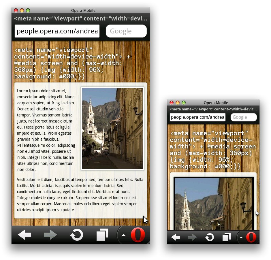
In the example below, I give all images a width of 96% of their container as well as a black background, provided the viewport width is equal to or smaller than 360px. This makes sure the image is nicely centered on smaller screens, while the black background is there just to highlight that there is something special going on.
@media screen and (max-width: 360px) {
	img {
		width: 96%;
		background: #000;
	}
}
A major caveat here is that if we don’t set the viewport explicitly in our document, the media query will not be triggered in our mobile browser. Indeed, in its default setting, Opera Mobile renders the document with an assumed 980px wide viewport, therefore the media query is not applied.
To solve this, we can simply define the viewport width as being equal to device-width:
<meta name="viewport" content="width=device-width">
or in CSS,
@-o-viewport {
	width: device-width;
}
This will give the page a viewport equal to the screen’s width — it will scale up the page content accordingly — and trigger our media query to be applied on devices that are as wide or narrower than 360px. Opera Mobile running on the Nokia 5800 (which is 360px wide in portrait mode) will thus show the images at 96% of their container, just like Safari on the 2nd gen iPod Touch (which is 320px wide). A screen with a 480px width however will not apply the media query (see Figure 5).
In these examples, we’re using max/min-width media queries rather than the max/min-device-width variant. Although the latter should work as well, they are a bit less practical as they don’t come into action when resizing your browser window on desktop — the width of your computer screen always stays the same. max/min-width media queries on the other hand do react to desktop browser window resizing, which is handy for development and nice for your users when they run your site in a smaller window.
So, using a smart combination of viewport and media query settings, it is effectively possible to create one single site that works well on desktop and mobile. For inspiration and plenty of real-world examples, have a look at the mediaqueri.es gallery.
Going one level deeper — dealing with high-DPI screens
Now let’s look at optimizing pages for high-DPI screens.
A pixel is not what it seems
The recent generation of mobile devices comes with screens with extremely high DPI (dots per inch) — this makes it almost impossible to distinguish individual pixels and renders objects shown on the screen with very high fidelity. The problem however is that because the pixels are so small, web content becomes very tiny as well: text with a 11px sized font for instance will be minuscule, and on desktop normal looking images will be rendered fairly small. Therefore, Opera Mobile applies a default zoom level larger than 100% when run on high-DPI devices. In Opera Mobile on the HTC Desire for instance, this default zoom is 150%.
Said differently, this means that a pixel is not what it seems. When talking about pixels thus far we’ve talked about them in terms of CSS pixels, which are, believe it or not, a relative length unit. 1 CSS pixel can consist of multiple device pixels: in the case of Opera Mobile on the HTC Desire for instance, 1 CSS pixel is equal to 1.5 device pixels.
Preserving image crispiness
So, this larger-than-100% default zoom level increases legibility, but what about the fidelity of your content? Fonts, borders, and SVG files all render very crisp as they are vector-based, but for rasterized images it’s possible to experience some quality loss. There is an easy workaround for this though: you can include a high-resolution image in your page but constrain its width to, say, half of the original. When the image is shown on a high-DPI device, the default zoom and larger image size level each other out, and the image stays crisp. Consider the following scenario:
<img src="500px_image.jpg" width="250">
If the viewport width is set to be equal to the device-width, this image will be shown with a width of 250 device pixels on Safari on a 2nd gen iPod Touch. Opera Mobile on the HTC Desire will show it with a width of 375 device pixels (= 250×150%). And on device browsers with a 200% default zoom it will be 500 device pixels (= 250×200%). Crispiness is assured all the way!
A screen density media query
In case you want to take this further and do targeted fine tuning for particular screen densities, you can use the device-pixel-ratio media query, which allows you to only apply style rules depending on whether certain screen density-related conditions are met. The following CSS gives the 500×500px background image a background-size of 250px. This makes the tiles sharper when shown on high-DPI devices with a default zoom factor of 150% (= 3/2) or larger, such as the HTC Desire. The code would look as follows, and can be seen in action in Figure 6:
@media screen and (-o-min-device-pixel-ratio: 3/2) {
	body {
		background-size: 250px;
	}
}
Note that Opera only accepts ratios as device-pixel-ratio values (e.g. 3/2). The default Android browser on the other hand prefers numbers (e.g. 1.5). As this feature requires a vendor prefix at this point, it is just a matter of specifying the right value for each rendering engine.
width=device-width — note the magnified and somewhat pixelated background; on the right, an example with added device-pixel-ratio goodness, which results in much nicer, DPI-aware background image tilingSetting the target density
As you can guess from the previous sections, this a-pixel-is-not-a-pixel business also affects viewport settings. If we look at Opera Mobile on the HTC Desire again, we can see that setting the viewport to width=device-width results in it having a width of 320 CSS pixels, which in reality is represented by 480 device pixels (= 320 × 150%).
Sounds complicated? Well, here is some good news: in almost all cases, this is nothing to worry about. Let the mobile browser take care of all the scaling math, and limit your focus to tweaking your images a bit as described above, if at all.
However, there might be scenarios where you really need pixel-level control, such as for a mobile-optimized maps service: target-densitydpi is a viewport property that allows you to do this. If we give this property a value of device-dpi, we’re actually saying: “No scaling needed, thank you very much — and yes, I’m serious! Just make the viewport equal to as many CSS pixels as there are device pixels in the width of the screen.” The code for that looks as follows:
<meta name="viewport" content="width=device-width, target-densitydpi=device-dpi">
Opera Mobile does not come with support for target-densitydpi via @viewport, so your only option is to set it via a meta viewport tag for the time being.
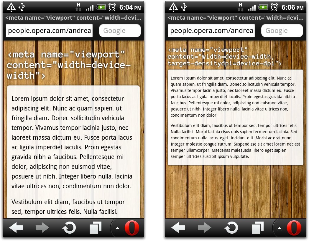
width=device-width — note the default scaling of 150%; on the right, an example with target-densitydpi set to device-dpi, which results in all scaling to be turned offBesides the device-dpi value, you can also set high-dpi, medium-dpi, low-dpi or an actual DPI number for the target-densitydpi property: this allows you to specify the target density for which your web page is designed. No worries if this sounds complicated — it’s rather unlikely you’ll need this at all.
One thing worth highlighting is that in the case where you set the target-densitydpi to device-dpi, you’ll want to optimize your layout for screens with different DPIs manually. This can happen through the aforementioned device-pixel-ratio media query, which conveniently allows you to define styles for specific screen densities.
Conclusion and references
This concludes our brief foray into the realms of viewport — play around with these values, and let us know what combination works best for you!
