The State of Web Type
Typography has a long and rich history, but much has been lost in the transition to the web. While browser support for typography has advanced a lot in the last couple years, we still have a long way to go. Features print designers take for granted are either nonexistent on the web or have insufficient browser support in order to be useful. Challenges unique to web browsers such as responsive design and web font loading could use some improvement as well. Let’s take a look at some of the features we need for an optimal and beautiful reading experience.
OpenType Features
Typeface designers often put extra features in a font that can be used to customise text rendering. These are called OpenType features and include character spacing, alignment, ligatures, alternative characters, and so on. There are in fact more than 140 registered OpenType features. Many of these features are optional, but some are actually required to properly render text (e.g. kerning and required ligatures). OpenType features are reasonably well supported by modern web browsers, but still come with a lot of caveats that make them hard to use.
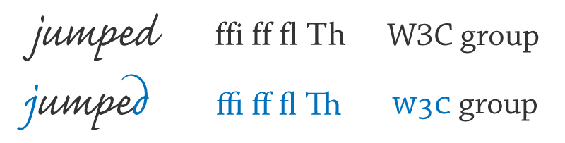
An important caveat is that not all fonts include all 140+ OpenType features. Most fonts only contain a small subset of features, such as kerning and ligatures. Others may include discretionary features, such as swashes and alternate characters. With the proliferation of web font and subsetting services we can’t always rely on information about OpenType features and character support provided by typeface designers. We need better tools to look inside our font files to see which features and characters are supported and which are not.
If a font includes the features you wish to use, you still need to check if your target browsers support OpenType features. While most modern browsers support either the low-level font-feature-settings syntax or the high level font-variant-* syntax, there are still several browsers in common use that don’t support either syntax. Notable examples are Internet Explorer versions 6 to 9 and all versions of Android WebKit until 4.4. Fortunately, the fallback behaviour for most OpenType features is graceful: text is still readable without them.
| Feature | IE10 | IE11 | Chrome | Firefox | Safari | Opera |
|---|---|---|---|---|---|---|
font-feature-settings | Yes | Yes | Yes | Yes | No | Yes |
Ligatures (liga) | Yes | Yes | Yes | Yes | Yes | Yes |
Swashes (swsh) | Yes | Yes | Yes | Yes | No | Yes |
Old style numerals (onum) | Yes | Yes | Yes | Yes | No | Yes |
Contextual alternates (calt) | Yes | Yes | Yes | Yes | Yes | Yes |
Small caps (smcp) | Yes | Yes | Yes | Yes | No | Yes |
The above table summarizes browser support for the font-feature-settings property and a select number of OpenType features. You can find more browser support data for common OpenType features on the State of Web Type.
Unfortunately, even if a browser supports the OpenType feature syntax it is not always guaranteed that it will support all individual features. A good (or rather bad) example is Safari which technically supports the font-feature-settings syntax, but ignores any value. Instead it explicitly enables a select number of features which you have no way of turning off.
Justification & Hyphenation
Many web developers think of justification as a solved problem (or worse, one to avoid). Set text-align to justify and you’re done, right? Not quite. The algorithm used in all web browsers is actually a very ineffective justification implementation. Tools like TeX and InDesign use a more sophisticated line breaking algorithm that optimises break points over an entire paragraph, whereas browsers only look at a single line. This leads to suboptimal justification and large spaces between words.
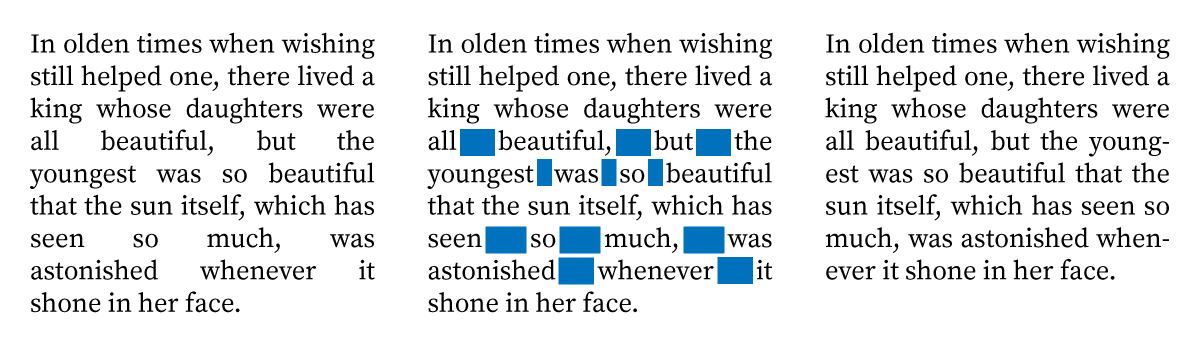
Browsers could implement the same line breaking algorithm as used in TeX, but have decided not to for performance reasons. This is an odd reason — TeX was developed and runs on computers much less powerful than those commonly used in mobile phones. Another way to improve poor line breaking is by hyphenating words. This introduces more potential line break points and reduces the chance of awkward line breaks. A common misunderstanding is that hyphenation is only useful for justified text. This is not true. Hyphenation is also a useful tool to control the raggedness of center, left, and right aligned text. The CSS hyphens property can be used to control hyphenation. Setting it to auto will enable hyphenation (provided the document or element specifies a language using the lang attribute), while setting it to none disables hyphenation.
| IE8 | IE9 | IE10 | IE11 | Chrome | Firefox | Safari | Opera |
|---|---|---|---|---|---|---|---|
| No | No | Yes | Yes | No | Yes | Yes | No |
The hyphens property is supported by almost all modern browsers except those based on the Blink rendering engine. Chrome and Opera previously supported the hyphens syntax but neither browser shipped with hyphenation dictionaries. In a surprising move they recently dropped support for the hyphens syntax completely. The Blink developers decided to remove the hyphens property because it was never fully implemented and broke feature detection. While such regressions are not common, they are worrisome. A feature required for correct text layout should be supported everywhere. So, for now, you’ll need to rely on either server-side hyphenation or one of the two client-side hyphenation libraries: Hypher and Hyphenator.
Font Loading
Web font usage has increased significantly in the past couple years. This is great news. However, it also means that web fonts have become a critical part of web sites and, by extension, a performance bottleneck. You may have experienced the dreaded Flash Of Invisible Text (FOIT) while visiting a website on a slow network connection. The decision by some browsers to block rendering of text until web fonts have downloaded is opposite to the tenets of progressive enhancement. Content should come first and web fonts are an enhancement. After all, you can still read the text, even though it might not render in the intended font (well, unless your browser hides text while it is downloading fonts — better pray it uses a timeout).
Not all browsers hide text while downloading web fonts. For example Internet Explorer always renders text in a fallback font while it is downloading fonts. This has been dubbed the Flash Of Unstyled Text (FOUT). This is a misnomer. The FOUT is a feature and a condition everyone should anticipate and design for. Selecting and testing fallback fonts is an important task while designing and building a site.
| IE9 | IE10 | IE11 | Chrome | Firefox | Safari | Opera | |
|---|---|---|---|---|---|---|---|
| font rendering | FOUT | FOUT | FOUT | FOIT | FOIT | FOIT | FOIT |
| timeout | n/a | n/a | n/a | 3 sec. | 3 sec. | ∞ | 3 sec. |
The above table shows the usage of the FOUT and FOIT across browsers. Note that Safari (and older Android WebKit versions) do not have a timeout. On these browsers, text won’t render until fonts have completely loaded.
Browser vendors are working on a proposal for a new CSS property to control font loading and rendering. It is meant to give developers more control over the blocking and swapping behaviour of web fonts. The proposed font-rendering property accepts three parameters:
block: block rendering of the text while fonts are downloading with an optional timeout;swap: use a fallback font and render the font when it becomes available with an optional timeout;optional: use the font if it is cached and otherwise use the fallback font. Do not re-render the page, even if the web font becomes available at a later time.
These parameters can also be used to develop custom font loading schemes. For example, for an important and fast loading font we can block text rendering for 1s. If the font doesn’t load within that time we can allow up to 10 seconds where it is acceptable to re-render the page.
font-rendering: block 1s swap 10s;
Browsers should standardize the default font loading behaviour once the font-rendering property is implemented. Ideally the default value should be block 0s swap infinite as used by Internet Explorer (i.e. the Flash of Unstyled Text). Blocking text rendering while loading fonts should be opt-in and not a default. Browser should treat web fonts as progressive enhancement by default and make content available as soon as possible. Opting out of that behaviour is the responsibility of a web developer and not the browser.
Until the font-rendering property is implemented we can use the CSS Font Loading API to implement the same behaviour in JavaScript. The Font Loading API is supported by Chrome, Opera, and soon Firefox. There is also a Font Loading API polyfill for browsers that do not support it natively.
Looking to the Future
This is just the tip of the iceberg. To compete with and surpass the typographic quality of print publications we need support for drop caps, colour fonts, advanced layout (akin to shapes, exclusions and regions), sizing text to fit a container, widows and orphans, balanced text, math typesetting (though MathML is now an officially recommended standard, Chromium and Internet Explorer have no plans to support it), and so on. Clearly, we need to do better and push browser vendors for these features if we want to improve the web’s reading experience. You can help out by participating in the W3C mailing lists, building demos, implementing polyfills and drafting specifications for features you want to see. Don’t worry about getting it right the first time. Sometimes the best thing to come out of a specification is a new and better specification.
Another way to contribute is to draw attention to partially implemented specifications and bugs by keeping track of what works and what doesn’t. That’s why I recently launched a new project called the State of Web Type. Its goal is to contain up to date browser support data for all type and typography features on the web. The project is open source and contributions and corrections are more than welcome. Let’s work together to make the web a better platform for publishing and reading!