Entries with “css” tag
What’s new in Chromium 70 and Opera 57
What’s new in Chromium 69 and Opera 56
What’s new in Chromium 67 and Opera 54
What’s new in Chromium 66 and Opera 53
What’s new in Chromium 65 and Opera 52
What’s new in Chromium 64 and Opera 51
What’s new in Chromium 63 and Opera 50
What’s new in Chromium 62 and Opera 49
What’s new in Chromium 60 and Opera 47
What’s new in Chromium 59 and Opera 46
What’s new in Chromium 58 and Opera 45
What’s new in Chromium 57 and Opera 44
What’s new in Chromium 56 and Opera 43
What’s new in Chromium 55 and Opera 42
What’s new in Chromium 54 and Opera 41
What’s new in Chromium 53 and Opera 40
What’s new in Chromium 52 and Opera 39
What’s new in Chromium 51 and Opera 38
What’s new in Chromium 50 and Opera 37
What’s new in Chromium 49 and Opera 36
Opera 35 released
CSSConf.asia & JSConf.asia
Opera 34 released
Opera 33 released
Opera 32 released
Houdini Task Force meeting report

Opera 31 released
Opera 30 released
Making websites that work well on Opera Mini
Fixing the scrollTop bug
Sex, Houdini and the Extensible Web

Opera 29 released
Interaction Media Features and their potential (for incorrect assumptions)

Opera Mini server upgrade
Opera 28 released
The State of Web Type
Responsive web design presentations at Fluent and State of the Browser
Opera 26 released
Opera 25 released
CSS: It was twenty years ago today — an interview with Håkon Wium Lie

Better @font-face with Font Load Events
Opera 24 released
Opera 23 released
Everything You Need to Know About the CSS will-change Property
Opera 22 released
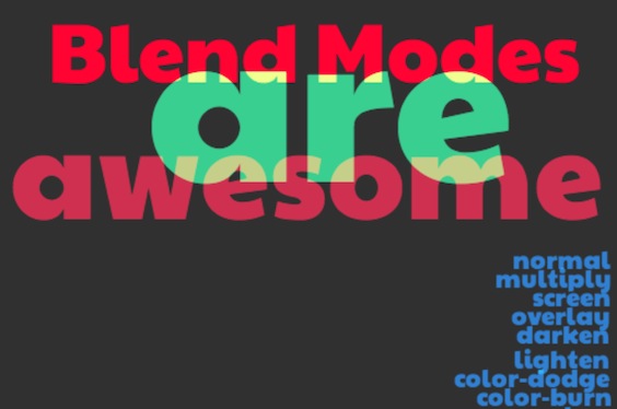
Getting to Know CSS Blend Modes
Opera 21 released
Understanding 3D Transforms

Opera’s WebKit Patches
Flexbox — Fast Track to Layout Nirvana?
Understanding the CSS Transforms Matrix
Opera Mobile Emulator Build With Experimental WebKit Prefix Support
A Christmas Present from the Opera Dragonfly Team!
CSS shorthands!
CSS3 Radial Gradients
CSS3 Multi-Column Layout
Social Innovation Camp Nigeria + University of Lagos
Postcards From TPAC
CSS Working Group F2F: WrapUp
CSS box-shadow Experiments
Opera Welcomes the W3C CSS Working Group
Update to CSS Inspector
Building a Custom HTML5 Video Player With CSS3 and jQuery
Cross-Browser CSS box-shadows
Vendor Prefixed CSS Supported in Opera 10.50 and 10.60
Bruce at SparkUp Poznan, Poland
Introduction to HTML5 Video