Responsive web design presentations at Fluent and State of the Browser
Earlier this year, I had the chance to speak at Fluent in San Francisco, and at State of the Browser in London. At both events, I talked about various new CSS features that have become available in mobile browsers and allow you to create compelling responsive designs.
The topics I covered in these talks included:
- device adaptation aka
@viewport resolutionmedia queriesobject-fit&object-position- viewport-percentage lengths
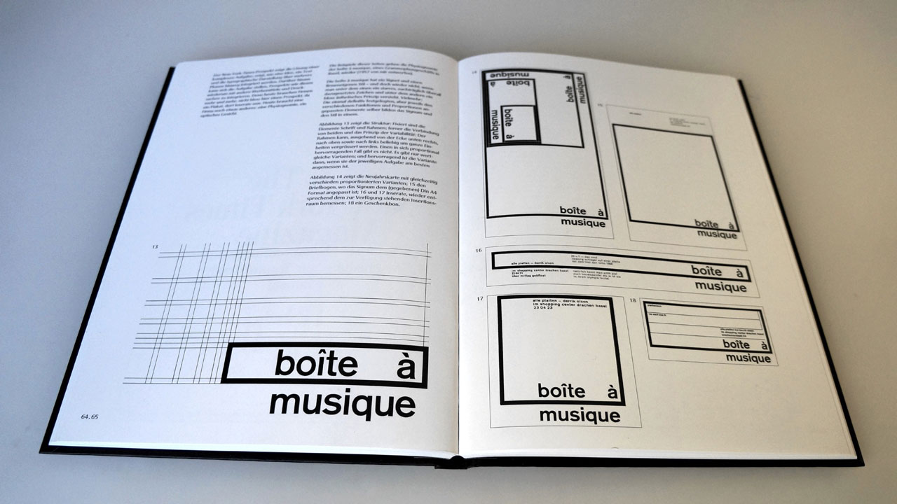
In the introduction to both presentations, I also went for a short trip down memory lane, and talked about the fascinating work of Karl Gerstner, a Swiss graphic designer and type pioneer who published an influential book called “Programme entwerfen” (1964), exploring the role of design in the early days of the computer era. The photo below shows you some of his experiments with programmatic design, and, to me at least, they are an early precursor of the whole “responsive design” concept. Visionary stuff!
You can find the full videos and slides of these talks below.
Enjoy!