Getting to Know CSS Blend Modes
CSS Blend Modes provide a way to specify how one layer will interact or “blend” with the one underneath. Until now, this was the domain of photo editing applications, but now they are available on the web using CSS itself!
What are CSS Blend Modes
If you have ever used a photo editing application extensively (like for example, Adobe Photoshop, Pixelmator, GIMP, etc.) then you might be familiar with Blend Modes. Like the name suggests, Blend Modes are various modes by which the one image will blend into the image underneath. Depending on the mode you choose, you will get different results with different effects.
These Blend Modes are now available in CSS as well via the Compositing and Blending Level 1 specification. Blend Modes are used to determine how a particular color will blend into the background layer’s color. The results can be very interesting indeed.
How Blend Modes work
Blend Modes are basically a set of different ways to determine what the final color of the image should be when an element (either partially, or fully) overlaps another one. In essence, these modes are mathematical functions, which use the mathematical representations of the colors of the source and background layers — for example RGBa, where values are between 0 and 1 for all the channels — and returns a final mathematical value for that particular pixel, which in the end, determines the color of that pixel. The exact formulas that each blend mode employs for determining colors can be read in the specification. For now, we’ll take a look at the various Blend Modes that are available to us in CSS, and what kind of effect they produce.
The various Blend Modes available in CSS
Normal
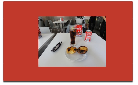
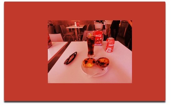
The normal blend mode just produces the source image without any visible effect.
Multiply
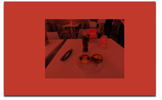
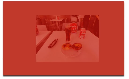
As the name suggests, the multiply blend mode multiplies the colors of the source image and the background image to get the final color. This typically results in a darkened image.
Screen
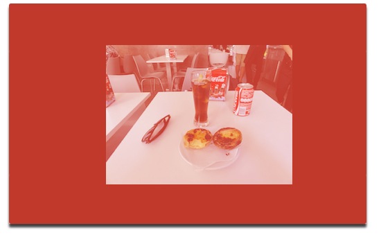
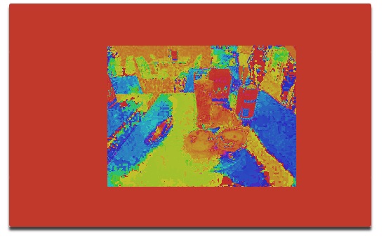
This is the opposite of multiply. The compliment (i.e, “1.0 — the color value”) of the source and the backdrop layers are multiplied, and then its compliment is taken to form the final color of the pixel.
Overlay
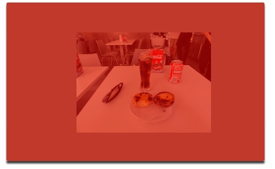
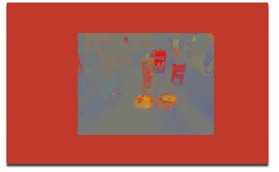
The overlay blend mode applies the screen blend mode to lighter pixels and multiply blend mode to darker pixels. This in effect means that it makes lighter pixels even lighter, and darker pixels even darker.
Darken
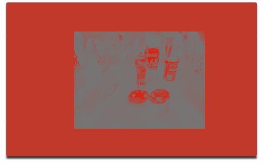
This mode applies whichever color tone is darker between the source and the backdrop colors.
Lighten
This mode is the opposite of darken. It applies whichever color tone is lighter between the source and the backdrop colors.
Color-Dodge
The Color-Dodge mode brightens the backdrop color, resulting in an image with stark contrast.
Color-Burn
This mode darkens the backdrop color, and increases the contrast between the source and the backdrop color.
Hard-Light
This is the opposite of overlay. It applies multiply on the lighter pixels and screen on the darker ones.
Soft-Light
This applies multiply on darker values and screen on lighter values. It is similar to overlay, but works slightly differently.
Hue
This mode applies the saturation and luminosity of the backdrop color, but with the hue of the source color.
Saturation
Saturation produces a color with the saturation of the source color, and blends the hue and luminosity of the background color.
Color
The color blend mode produces a color with the hue and saturation of the source color, and luminosity of the background color.
###Luminosity
This produces a color with the luminosity of the source color, and blends the hue and saturation of the background color.
Difference
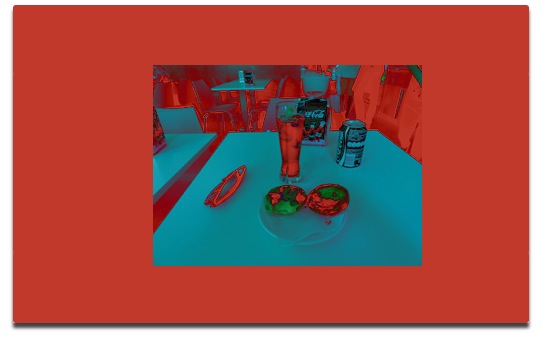
The difference blend mode subtracts the darker of the two colors from the lighter color, forming a kind of photo negative effect. Black is not affected, white is inverted absolutely, and the rest of colors are affected based on their brightness levels.
Exclusion
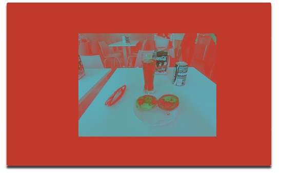
The exclusion blend mode produces a lower-contrast version of the effect produced by difference mode.
Some might not find it convenient to remember how each and every blend mode works exactly, so its helpful to group them into a few broad categories according to the general effect that they provide. We can group all these modes into the following:
- Darkening: The darken, multiply, and color-burn modes would fall into this category. These modes essentially darken the image in their own ways.
- Lightening: The lighten, screen and color-dodge modes essentially lighten up the image.
- Contrast: The overlay, soft-light and hard-light modes pretty much play up the contrast.
- Comparative: The difference and exclusion modes would fall in this category.
- Component: The hue, saturation, color and luminosity modes would come under this. The other Blend Modes work on each color channel independently, whereas the modes under this group work by singling out one component from the source layer and blending the other components from the source and background layer.
Working with mix-blend-mode
The mix-blend-mode property specifies how the source element will mix colors with the backdrop. The backdrop could be any element underneath the source element (for example a heading could be a source element and its container <div> the backdrop.). Using it is as simple as writing something like:
mix-blend-mode: difference
or
mix-blend-mode: overlay
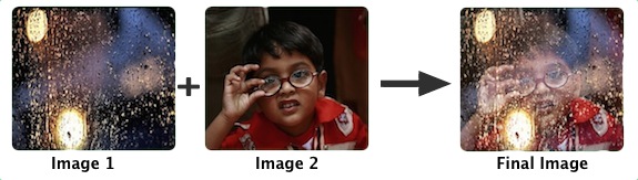
and so on. Note that this works with any kind of element. If you apply mix-blend-mode to an element, then it will mix its colors with any element which it is overlapping. Check out a page I made which showcases two images blending with each other!
Using the isolation property
If you use mix-blend-mode then it will blend the element with all the elements in the backdrop that it overlaps. What if you want a set of elements to blend with each other (say in a container <div>) but not with any other elements underneath?
If you can do that by isolating that <div> by using the isolation property. For example,
div {
	isolation: isolate;
}
This creates a new stacking context, and the elements will blend only within that stacking context and not with any others underneath.
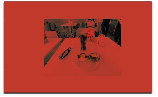
A demo here uses mix-blend-mode and the isolate property. Here we have applied isolation to the <div> that contains the picture. If we don’t use the isolation property, then it will blend into the layer beneath the picture as well. You can see both effects by checking the checkbox and see how the image is different in both cases.
Working with background-blend-mode
The background-blend-mode property specifies how the source element is supposed to mix its color of its own background image and background color. If there are any other layers underneath the element (for example a section element with a blue background color) it will not mix its colors with that element. It will only mix its colors with the background image and colors specified for its own self in the CSS.
An example of its use would be the following:
background-image: url(images/sample.png);
background-color: red;
background-blend-mode: multiply;
If you are using multiple background images, then you can apply multiple background Blend Modes for those respectively. For example:
background-image: url(images/sample1.png), url(images/sample2.png);
background-color: blue;
background-blend-mode: screen, overlay;
In the above example, the image sample1.png will get the screen blend mode applied to it, while sample2.png will get the overlay mode applied to it.
Using Blend Modes with other technologies
Gradients
You can also use all these modes in combination with gradients and masks to form interesting effects in your designs. One of the most promising use cases that I foresee for this is the use of radial gradients for images. For example, the following image:
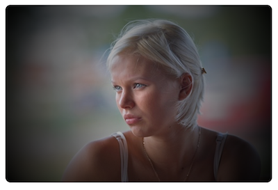
You can see a working demonstration of the above effect on the demo page. All we have done in that demo is to have a transparent-to-black radial gradient (in the case of the linear gradient, its transparent-to-yellow) and on top we have placed the image and applied a multiply blend mode using mix-blend-mode: multiply. When the user hovers over the picture, we use mix-blend-mode: normal to remove the effect.
Masks, Animations and Filters
One simple (some would say obvious!) point to remember is that when you are using masking, the mask layer will be the highest layer in the stacking context. This means that you need to make sure that whatever layers you want blended, are visible through the mask.
Blend Modes also work fine with animated elements, though they themselves are not animatable properties. See this demo where we used Blend Modes with CSS masks and animations. Notice that we’ve applied a separate mix-blend-mode to blend the text as well as the image. You can even add CSS filters to blended images to further tweak and optimize your designs.
Video
Though we’ve focused more on images in this article, but Blend Modes can also be applied to video using mix-blend-mode. If you add on top blended images or text, you can create some complex effects or presentations. This further enhances the possibilities you can achieve using these modes.
Blend Modes in Canvas
Blend Modes are also available in <canvas> via the Canvas 2D Context API. All you need to do is to set the globalCompositeOperation property on the canvas 2d context to whatever Blend Modes you like.
A lot of times you might want to further control the image by tweaking the opacity, which can be done with the globalAlpha property.
For example:
var canvas = document.querySelector('canvas');
var context = canvas.getContext('2d');
// Everything drawn on this context will now have
// a “screen” blend mode applied to it.
context.globalCompositeOperation = 'screen';
// Drawn elements will have an alpha channel of 0.7
context.globalAlpha = 0.7;
I’ve made a couple of small demos of canvas utilizing Blend Modes through globalCompositeOperator which you can take a look at. You can also take a look at this writeup by Adobe where they talk more about Blend Modes in canvas.
Blend Modes in SVG
The specification also allows you to add blends via CSS inside SVG documents.
<svg xmlns="http://www.w3.org/2000/svg">
	<style>
		rect {
			mix-blend-mode: multiply;
		}
	</style>
	<rect x="10" y="10" width="100" height="100" rx="15" ry="15" fill="#ff0000"/>
	<rect x="40" y="40" width="100" height="100" rx="15" ry="15" fill="green"/>
</svg>
Of course, in SVG you can also use feImage and feBlend to add Blend Modes, but most would agree that it’s preferable to add it via CSS as mentioned above, as it is much more convenient.
Browser Support
Chromium-based browsers (i.e. Chrome and Opera) have the most support for CSS Blend Modes at the moment: they have support for both background-blend-mode as well as mix-blend-mode.
Firefox right now does not have support for the isolation property, but you can still play with the other properties by searching for them in about:config and enabling it there. Safari is slated to have support for blend modes in the next release coming along with OS X Yosemite, and you can already play with it by downloading the latest nightlies. Internet Explorer does not have support for these properties thus far.
Until browser support has improved, it is advisable to use CSS Blend Modes in production as an enhancement to existing designs and not as a critical part of the design. However, for demonstration purposes, it’s best that you view the linked demos in a browser which has support for both background-blend-mode and mix-blend-mode. The Adobe Web Platform Team maintains a page detailing blend mode support for various browsers which is quite detailed.
Feature Detection for Blend Modes
It is important to use Blend Modes using feature detection. You can detect both support for mix-blend-mode and background-blend-mode using JavaScript like so:
if ('CSS' in window && 'supports' in window.CSS) {
	var supportsMixBlendMode = window.CSS.supports('mix-blend-mode', 'multiply');
	var supportsBackgroundBlendMode = window.CSS.supports('background-blend-mode', 'multiply');
	var supportsIsolation = window.CSS.supports('isolation', 'isolate');
	…
}
This will return true if it detects support for it, and false otherwise.
However, the most robust solution is to use Modernizr’s testProp() functionality to test for the feature, like so:
var mixBlendModeSupport = Modernizr.testProp('mixBlendMode');
var backgroundBlendModeSupport = Modernizr.testProp('backgroundBlendMode');
var isolationSupport = Modernizr.testProp('isolation');
It will return true if the browser has support for it, and false otherwise.
It is also possible to use the @supports feature for it, like so:
@supports(mix-blend-mode: screen) {
	…
}
If you want to determine support for both mix-blend-mode and background-blend-mode properties, you could write:
@supports((mix-blend-mode: screen) and (background-blend-mode: screen)) {
	…
}
Conclusion
Blend Modes are great for applying different effects to elements within a web page, a feature that was previously unavailable to us using web technologies. It is an upcoming technology, and, at the time of this writing, browser support is patchy, but it is expected to become much better over time. You can apply some fantastic tweaks and effects with Blend Modes, so in the future you won’t need to start up a photo editor application just to apply nice effects on the graphical elements of your page.
Useful Links
- The Specification — CSS Compositing and Blending Level 1
- The Adobe Web Platform Team’s Page for Blending and Compositing
- The Adobe Web Platform Team: Blending features in Canvas
- The Basics of CSS Blend Modes
Credit:
Image credit: Ricardo Liberato, Swaminathan and Phil Roeder.