Building a Custom HTML5 Video Player With CSS3 and jQuery
Introduction
The HTML5 <video> element is already supported by most modern browsers, and even IE has support announced for version 9. There are many advantages of having video embedded natively in the browser (covered in the article Introduction to HTML5 video by Bruce Lawson), so many developers are trying to use it as soon as possible. There are a couple of barriers to this that remain, most notably the problem of which codecs are supported in each browser, with a disagreement between Opera/Firefox and IE/Safari. That might not be a problem for much longer though, with Google recently releasing the VP8 codec, and the WebM project coming into existence. Opera, Firefox, Chrome and IE9 all have support in final builds, developer builds, or at least support announced for this format, and Flash will be able to play VP8. This means that we will soon be able to create a single version of the video that will play in the <video> element in most browsers, and the Flash Player in those that don’t support WebM natively.
The other major barrier to consider is building up a custom HTML5 <video> player – this is where a Flash-only solution currently has an advantage, with the powerful Flash IDE providing an easy interface with which to create a customized video player component. IF we want to write a customised player for the HTML5 <video> element we need to handcode all the HTML5, CSS3, JavaScript, and any other open standards we want to use to build a player!
And this is where this article comes in. This is the first of a series in which we will look at building up an easily customizable HTML5 <video> player, including packaging it as a simple jQuery plugin, choosing control types and outputting custom CSS for your own situation. In this article we will look at:
- Video controls
- Basic markup for controls
- Packaging the player as a jQuery plugin
- Look and Feel
- Theming the player
We’ll use jQuery for easier DOM manipulation, and jQuery UI for the slider controls used for seeking and changing the volume level. To build a scalable solution, we’ll wrap everything up in a jQuery plugin.
Video controls
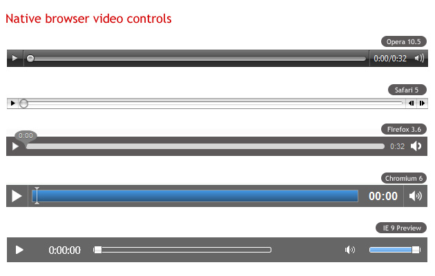
As professional web designers, we want to create a video player that looks consistent across browsers. Each browser however provides its own different look and feel for the player, from the minimal approach of Firefox and Chrome, to the more shiny controls of Opera and Safari (see Figure 1 for the controls in each browser). If we want our controls to look the same across all browsers, and integrate with our own design, we’ll have to create our own controls from scratch. This is not as hard as it seems.
All media elements in HTML5 support the media elements API, which we can access using JavaScript and use to easily wire up functions such as play, pause, etc. to any buttons we create. Because the native video player plays nicely with other open web technologies, we can create our controls using HTML, CSS, SVG or whatever else we like.
Basic markup for controls
First, we’ll need to create the actual markup for the video controls. We’ll need a Play/Pause button, a seek bar, a timer and a volume button and slider. We’ll insert the markup for the controls after the <video> element, and wrap them up in another element.
<div class="ghinda-video-controls">
	<a class="ghinda-video-play" title="Play/Pause"></a>
	<div class="ghinda-video-seek"></div>
	<div class="ghinda-video-timer">00:00</div>
	<div class="ghinda-volume-box">
		<div class="ghinda-volume-slider"></div>
		<a class="ghinda-volume-button" title="Mute/Unmute"></a>
	</div>
</div>
We’ve used classes instead of IDs for all elements, to be able to use the same code for multiple video players on the same page.
Packaging the player as a jQuery plugin
After creating the markup we’ll have to tie our elements to the media elements API, in order to control the video’s behavior. As noted before, we’ll package the player as a jQuery plugin, which will also aid reuse on multiple elements.
Author’s note: I’m going to assume you are familiar with the basic anatomy of a jQuery plugin, and JavaScript, so I’m only briefly going to explain the script. If you need more information on these subjects, consult Craig Buckler’s How to develop a jQuery plugin tutorial, and the JavaScript section of the Opera web standards curriculum.
$.fn.gVideo = function(options) {
	// build main options before element iteration
	var defaults = {
		theme: 'simpledark',
		childtheme: ''
	};
	var options = $.extend(defaults, options);
	// iterate and reformat each matched element
	return this.each(function() {
		var $gVideo = $(this);
		// create HTML structure
		// main wrapper
		var $video_wrap = $('<div></div>').addClass('ghinda-video-player').addClass(options.theme).addClass(options.childtheme);
		// controls wraper
		var $video_controls = $('<div class="ghinda-video-controls"><a class="ghinda-video-play" title="Play/Pause"></a><div class="ghinda-video-seek"></div><div class="ghinda-video-timer">00:00</div><div class="ghinda-volume-box"><div class="ghinda-volume-slider"></div><a class="ghinda-volume-button" title="Mute/Unmute"></a></div></div>');
		$gVideo.wrap($video_wrap);
		$gVideo.after($video_controls);
	});
};
Here we are using jQuery to create the video player markup dynamically (but not the video player itself), and removing the controls attribute once the script loads. That’s because in cases where the user has JavaScript disabled, these controls will be useless, and he/she won’t even get the native browser controls to the video element. It makes a lot more sense to start with the controls attribute present in case the script fails to load, and then removing it so the player will use our custom controls only after the script successfully loads.
Next, we’ll have to target each of the elements in the controls, in order to be able to add listeners.
// Get newly created elements
var $video_container = $gVideo.parent('.ghinda-video-player');
var $video_controls = $('.ghinda-video-controls', $video_container);
var $ghinda_play_btn = $('.ghinda-video-play', $video_container);
var $ghinda_video_seek = $('.ghinda-video-seek', $video_container);
var $ghinda_video_timer = $('.ghinda-video-timer', $video_container);
var $ghinda_volume = $('.ghinda-volume-slider', $video_container);
var $ghinda_volume_btn = $('.ghinda-volume-button', $video_container);

$video_controls.hide(); // Keep the controls hidden
We’re targeting each control by its class; we’ll keep the controls hidden until everything is ready.
Now for the Play/Pause controls:
var gPlay = function() {
	if($gVideo.attr('paused') == false) {
		$gVideo[0].pause();
	} else {
		$gVideo[0].play();
	}
};

$ghinda_play_btn.click(gPlay);
$gVideo.click(gPlay);

$gVideo.bind('play', function() {
	$ghinda_play_btn.addClass('ghinda-paused-button');
});

$gVideo.bind('pause', function() {
	$ghinda_play_btn.removeClass('ghinda-paused-button');
});

$gVideo.bind('ended', function() {
	$ghinda_play_btn.removeClass('ghinda-paused-button');
});
Most browsers provide a secondary set of controls for the video in the right-click (Ctrl-click on a Mac) context menu. Because of the way we are putting this together, if a user activated these alternative controls it would break our custom controls. In order to avoid this we’re attaching events to the Play/Pause button itself, and the “Play”, “Pause” and “Ended” listeners of the video player.
We’re also adding and removing classes from our button to change the look of it, depending on the state of the video (Playing or Paused).
For creating the seek slider we’ll use the jQuery UI Slider component.
var createSeek = function() {
	if($gVideo.attr('readyState')) {
		var video_duration = $gVideo.attr('duration');
		$ghinda_video_seek.slider({
			value: 0,
			step: 0.01,
			orientation: 'horizontal',
			range: 'min',
			max: video_duration,
			animate: true,
			slide: function(){
				seeksliding = true;
			},
			stop:function(e,ui){
				seeksliding = false;
				$gVideo.attr('currentTime', ui.value);
			}
		});
		$video_controls.show();
	} else {
		setTimeout(createSeek, 150);
	}
};

createSeek();
As you can see, we’re using a recursive function, while reading the readyState of the video. We have to keep polling the video until it is ready, otherwise we can’t determine the duration, and can’t create the slider. Once the video is ready, we initialize the slider, and also show the controls.
Next we’ll create the timer, and attach it to the timeupdate listener of the video element.
var gTimeFormat = function(seconds){
	var m = Math.floor(seconds / 60) < 10 ? '0' + Math.floor(seconds / 60) : Math.floor(seconds / 60);
	var s = Math.floor(seconds - (m * 60)) < 10 ? '0' + Math.floor(seconds - (m * 60)) : Math.floor(seconds - (m * 60));
	return m + ':' + s;
};

var seekUpdate = function() {
	var currenttime = $gVideo.attr('currentTime');
	if(!seeksliding) $ghinda_video_seek.slider('value', currenttime);
	$ghinda_video_timer.text(gTimeFormat(currenttime));
};

$gVideo.bind('timeupdate', seekUpdate);
Here we’re using the seekUpdate function to get the currentTime attribute of the video, and the gTimeFormat function to format the actual value received.
For the volume controls, we’ll also use the jQuery UI slider and a custom function on the volume button for muting and un-muting the video.
$ghinda_volume.slider({
	value: 1,
	orientation: 'vertical',
	range: 'min',
	max: 1,
	step: 0.05,
	animate: true,
	slide:function(e,ui){
		$gVideo.attr('muted', false);
		video_volume = ui.value;
		$gVideo.attr('volume', ui.value);
	}
});

var muteVolume = function() {
	if($gVideo.attr('muted')==true) {
		$gVideo.attr('muted', false);
		$ghinda_volume.slider('value', video_volume);

		$ghinda_volume_btn.removeClass('ghinda-volume-mute');
	} else {
		$gVideo.attr('muted', true);
		$ghinda_volume.slider('value', '0');

		$ghinda_volume_btn.addClass('ghinda-volume-mute');
	};
};

$ghinda_volume_btn.click(muteVolume);
Finally we’re going the remove the controls attribute from the <video>, because by this point our own custom controls are set up and we want to use those instead of the browser defaults.
$gVideo.removeAttr('controls');
Now that we have our plugin all done, we can call it on any video element we want, like so.
$('video').gVideo();
This will call the plugin on all the video elements on the page.
Look and Feel
And now for the fun part, the look and feel of the video player. Once the plugin is ready, customizing the controls is really easy with a little bit of CSS. As you’ve notice we haven’t added any styling to the controls. We’ll use CSS3 for all the customizations regarding the player.
First, we’ll add some style to the main video player container. We’ll use this as the main chrome for the player.
.ghinda-video-player {
	float: left;
	padding: 10px;
	border: 5px solid #61625d;

	-moz-border-radius: 5px; /* FF1+ */
	-ms-border-radius: 5px; /* IE future proofing */
	-webkit-border-radius: 5px; /* Saf3+, Chrome */
	border-radius: 5px; /* Opera 10.5, IE 9 */

	background: #000000;
	background-image: -webkit-gradient(linear, left top, left bottom, color-stop(0, #313131),color-stop(1, #000000)); /* Saf4+, Chrome */
	background-image: -moz-linear-gradient(top, #313131, #000000); /* FF3.6 */
	background-image: linear-gradient(#313131, #000000);

	box-shadow: inset 0 15px 35px #535353;
}
We’ve floated it left, to prevent it from expanding to the full width of the player, instead keeping it restrained to the width of the actual video element. We’re using gradients and border radius to add polish, plus an inset box shadow to emulate the gradient effect in Opera, as it does not yet support gradients (as of 10.60, the latest version at the time of writing).
Next we’ll float all the controls to the left, to align them horizontally. We’ll use opacity and transitions on the Play/Pause and Volume Mute/Unmute buttons to create a nice hover effect.
.ghinda-video-play {
	display: block;
	width: 22px;
	height: 22px;
	margin-right: 15px;
	background: url(../images/play-icon.png) no-repeat;

	opacity: 0.7;

	-webkit-transition: all 0.2s ease-in-out; /* Safari and Chrome */
	-moz-transition: all 0.2s ease-in-out; /* Firefox */
	-ms-transition: all 0.2s ease-in-out; /* IE future proofing */
	-o-transition: all 0.2s ease-in-out; /* Opera */
	transition: all 0.2s ease-in-out;
}

.ghinda-paused-button {
	background: url(../images/pause-icon.png) no-repeat;
}

.ghinda-video-play:hover {
	opacity: 1;
}
I’m sure you followed the JavaScript part carefully, and saw that we’re adding and removing classes on the Play/Pause button depending on the state of the video(Playing/Paused). That’s why the ghida-paused-button class overwrites the background property of the ghinda-video-play class.
Now for the sliders. As you saw before, we’re using the jQuery UI slider control for both the seek bar and the volume level. This component has its own styles defined in jQuery UI’s stylesheet, but we’ll completely overwrite these to make the look of the slider more in keeping with the rest of the player.
.ghinda-video-seek .ui-slider-handle {
	width: 15px;
	height: 15px;
	border: 1px solid #333;
	top: -4px;

	-webkit-border-radius:10px;
	-moz-border-radius:10px;
	-ms-border-radius:10px;
	border-radius:10px;

	background: #e6e6e6;
	background-image: -webkit-gradient(linear,left top,left bottom,color-stop(0, #e6e6e6),color-stop(1, #d5d5d5));
	background-image: -moz-linear-gradient(top, #e6e6e6, #d5d5d5);
	background-image: linear-gradient(#e6e6e6, #d5d5d5);

	box-shadow: inset 0 -3px 3px #d5d5d5;
}

.ghinda-video-seek .ui-slider-handle.ui-state-hover {
	background: #fff;
}

.ghinda-video-seek .ui-slider-range {
	-moz-border-radius:15px;
	-ms-border-radius:15px;
	-webkit-border-radius:15px;
	border-radius:15px;

	background: #4cbae8;
	background-image: -webkit-gradient(linear,left top,left bottom,color-stop(0, #4cbae8),color-stop(1, #39a2ce));
	background-image: -moz-linear-gradient(top, #4cbae8, #39a2ce);
	background-image: linear-gradient(#4cbae8, #39a2ce);

	box-shadow: inset 0 -3px 3px #39a2ce;
}
Currently the volume slider is also visible at all times, positioned next to the volume button. We’ll change this so the slider is hidden by default, and shows up only when we’re hovering the Mute/Unmute button, to make it look a bit more dynamic and neater. Again, transitions are our answer here:
.ghinda-volume-box {
	height: 30px;

	-moz-transition: all 0.1s ease-in-out; /* Firefox */
	-ms-transition: all 0.1s ease-in-out; /* IE future proofing */
	-o-transition: all 0.2s ease-in-out; /* Opera */
	-webkit-transition: all 0.1s ease-in-out; /* Safari and Chrome */
	transition: all 0.1s ease-in-out;
}

.ghinda-volume-box:hover {
	height: 135px;
	padding-top: 5px;
}

.ghinda-volume-slider {
	visibility: hidden;
	opacity: 0;

	-moz-transition: all 0.1s ease-in-out; /* Firefox */
	-ms-transition: all 0.1s ease-in-out; /* IE future proofing */
	-o-transition: all 0.1s ease-in-out; /* Opera */
	-webkit-transition: all 0.1s ease-in-out; /* Safari and Chrome */
	transition: all 0.1s ease-in-out;
}

.ghinda-volume-box:hover .ghinda-volume-slider {
	position: relative;
	visibility: visible;
	opacity: 1;
}
We’re hiding the volume slider by default, and giving the volume container a small fixed height that just fits the width of the volume button. We’re also assigning transitions to both.
When the volume button is hovered, its height increases via the specified transition; we then use the .ghinda-volume-box:hover .ghinda-volume-slider descendant selector to transition the volume slider into view.
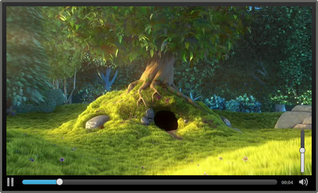
With basic CSS knowledge and some new CSS3 properties, we’ve already created a nice interface for our player, it looks like Figure 2:
Theming the player
As you probably noticed, when creating the jQuery plugin, we’ve defined a set of default options. These options are theme and childtheme, and can be changed when calling the plugin, allowing us to easily apply custom themes as desired.
A theme represents a completely new set of CSS rules for every single control. A child theme on the other hand is a set of CSS rules that builds upon the rules of an existing theme, adding or overwriting the “parent” theme’s style.
We can specify both of there options or only one, when calling the jQuery plugin.
$('video').gVideo({
	childtheme:'smalldark'
});
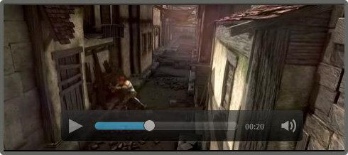
In the above example code we are calling the plugin with the smalldark child theme specified. This will apply our default parent theme, and then apply our child theme over the top of it, overwriting a small portion of the rules set by the parent theme. See Figure 3 for the Smalldark theme in action.
You can check out the final video player example live to see both themes in action.
The techniques contained within these articles about HTML5 <video> have resulted in a production-ready jQuery plugin. You can check out the latest version, and follow the development, on the Github repository for the Acorn Media Player. This code is up to date and actively maintained.
Summary
Building our own custom video player with HTML5 video, JavaScript and CSS3 is fairly easy. By using JavaScript only for the actual functionality of the controls, and CSS3 for everything that involves the look and feel of the player, we get a powerful, easily customizable solution.